On Wed, Oct 15, 2014 at 6:34 PM, Jürgen Hestermann <
[email protected]> wrote:
> But IMO the majority of icons is meaningless.
> Some even look very similar although they mean
> complete different things.
> Therefore I don't like them.
>

I was talking about the general idea for icons. Lazarus' icons aren't the
best though. The most immediate problem - IMO - is the use of color: which
is none. Almost all icons have a blue color making it hard to distinguish
them. Also the current icons do not have clean contrast in their outlines
which makes their outline invisible. As a rule of thumb, it should be
possible to locate an icon even when you squint.

IMO the older Lazarus icons were better for that, as shown here (notice the
strong outline and color use):
http://wiki.lazarus.freepascal.org/images/e/eb/ReactOS.png

Also having icons that relate to the similar thing have similar colors
help. For example in the image above all icons that relate to forms have a
red/gray palette and all icons that relate to files have a white palette.
Saving isn't consistent though - the diskettes could have the same colors
(this dark yellowish one) but they dont. Also the folder could use a
similar color (light yellow like mos folders).

Having the same palette for all icons isn't good. See the backlash that
Visual Studio 2012 got for making everything gray initially and how they
added more color after that because of it.

Also IMO some icons in Lazarus aren't good as pictures. For example the
"New form" icon has controls in it - it should be empty (as it is right now
gives the impress that it will show some settings, at least from a first
look). The "Tab order" icon uses two arrows - this means nothing really
when it comes to ordering - in this case it is about specifying a sequence,
so something linear (like a vertical list of items) or something that shows
the nature of the ordering (like a few tiny controls with numbers) would be
better. The current icon is also the same (on what it shows) as the restart
icon. Similarly the Anchor editor icon isn't really helpful - sure, you
edit anchors, but the real purpose of the editor is to specify layout. A
3x3 grid or something like that with L/R/T/B letters could be better. Or
some controls with the guidelines drawn. In other cases the images are
inconsistent: beyond the restart vs tab order i mentioned above, the Object
inspector and Project inspector icons are essentially the same (the gray
circle in project is barely visible and i actually noticed it after looking
the two icons for some time). In this case the Object inspector is the odd
one out since it looks like the "box, pyramid, sphere" icon is used to mean
"Project" in other icons. Another case is the "Jump Back" and "Jump
Forward" buttons which use the binoculars even though they have nothing to
do with search and are instead about navigation (the binoculars are
otherwise used for searching stuff in other icons).
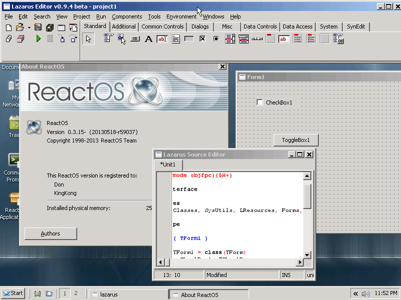
--
_______________________________________________
Lazarus mailing list
[email protected]
http://lists.lazarus.freepascal.org/mailman/listinfo/lazarus