2014-10-24 23:34 GMT+02:00 Giuliano Colla <[email protected]>:
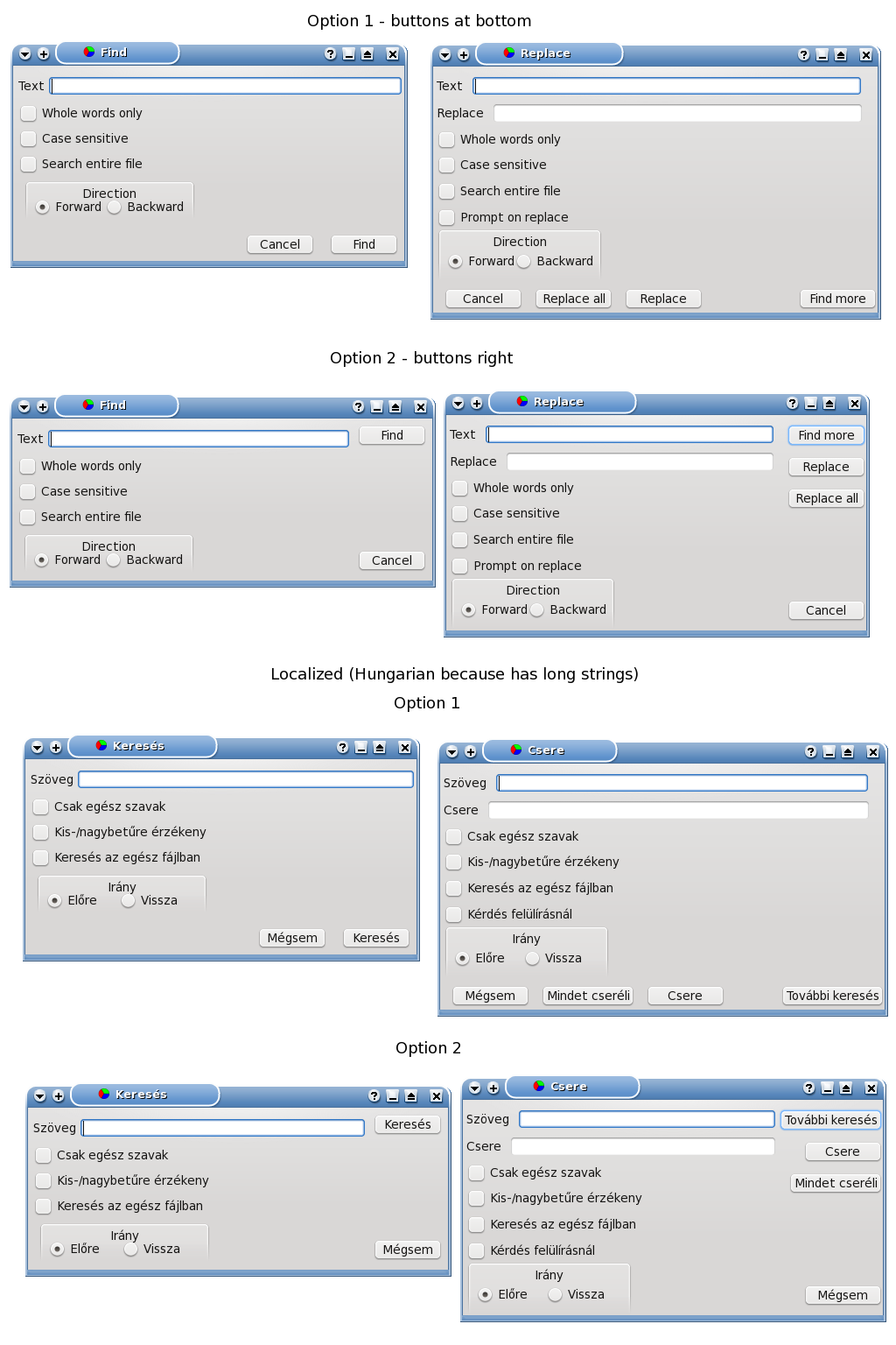
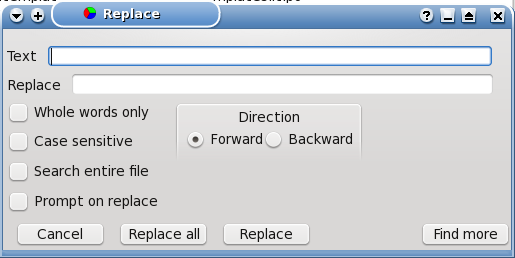
>
> Il 24/10/2014 17:19, waldo kitty ha scritto:
>
>> On 10/24/2014 4:39 AM, Jürgen Hestermann wrote:
>>
>>> Why is the "Direction" box placed on the right of all other options?
>>> IMO it is just another option as all the others so it should be put below
>>> these other options. This would also avoid the problem of moving
>>> this box when text becomes long.
>>>
>>
>> this is similar to my suggestion posted previously ;)
>>
>>
> Taking into account all suggestions, I came out with two possible layouts:
>
> Option 1 = Buttons at the bottom of the form (like in my previous version)
>
> Option 2 = Buttons at the right of the form (like in the original version)
>
> (there's also a help button, which is not visible by default, but it may
> become visible, if the appropriate option is selected. It would go either
> at the extreme right, or at the bottom, moving nearby button right or up
> because of anchoring):
>
> http://www.bononiadocta.it/Lazarus/Dialogues/Dialogues.png
>
> I've put in the image also a localized version, to see what it looks like
> when strings become much longer.
> I'd choose option 2 because bottom line risks to become crowded if the
> help button is added, but I'd like to hear other opinions.
>
> I prefer http://www.bononiadocta.it/Lazarus/Finddialog2.en.png and if it
is not clear that the options are in two columns, maybe a there should be
groupbox around it both columns. To me it seems foolish to leave such an
area wasted because you want search direction in the same column.


Vincent
--
_______________________________________________
Lazarus mailing list
[email protected]
http://lists.lazarus.freepascal.org/mailman/listinfo/lazarus