@Water, below is the first reply which was held in the moderator queue. I
thought it would be released and eventually come through. But, I just
received a rejection notice due to the attached image.
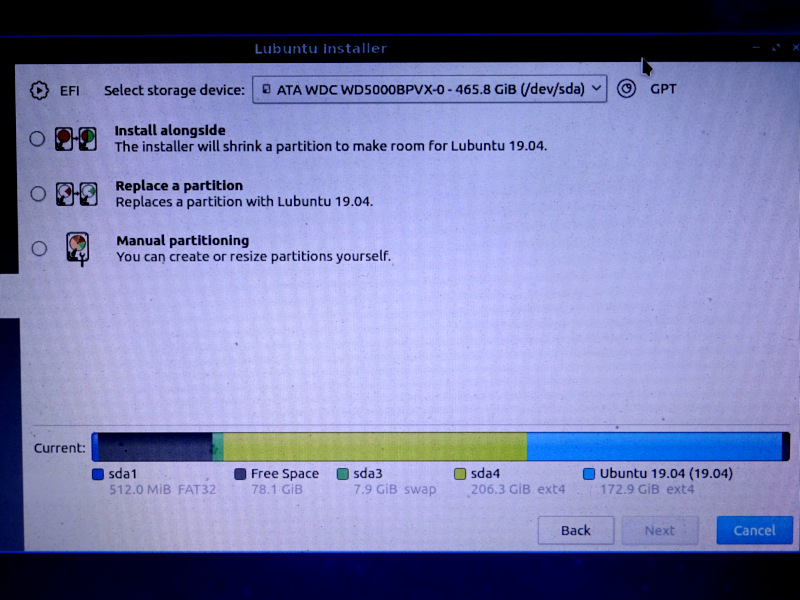
Sorry for the conversation being out of order. I should have reposted
immediately without the attachment. As mentioned earlier, the screen shot
is posted here: https://i.postimg.cc/rmtWgpV6/DSC01030.jpg

---------- Forwarded message ---------
On Sat, Apr 20, 2019 at 11:48 PM Walter Lapchynski <[email protected]> wrote:

Right click on the taskbar and select "Configure panel" and play around
> with the options in custom styling. More sweeping changes to the system
> can be done in Preferences → LXQt Settings → Appearance.
>

Thanks. I wasn't aware of taskbar styling. I've seen the
Prefs->settings->Appearance. It looks like all I can do is pick a different
theme, not edit a particular (the title bar of windows)?

I worried about changing the entire theme, changing more than I want. But,
I can try that.


> > I was a little rattled about accepting what it was going to do.
>
> Even after reading the summary at the end?
>


>[...]
> I'm struggling to to understand what you're trying to explain. Could you
> perhaps go through the process again (say, in a virtual machine), and
> keep track of the steps necessary to see this?
>

I booted the install media again and took a screen shot. See attached. (The
only thing different: when I installed 19.04, the existing partition was
18.04.).

What gave me pause is that the partitions seemed out of order. I thought I
had root, swap and an extra partition for old stuff I don't access much (in
that order). When I saw the installer's graphical depiction, it looked like
I was being invited to install into that extra partition. What compounded
that perception was how *that* partition doesn't show the sdaN identifier.

The old installer would ask identify the existing Lubuntu partition and ask
to install over it. That seemed like an easy choice to make.

This installer provides more info (reminding me of the old installer's
advanced, custom "create your own partitions" option). So, that extra info
makes you pause and think more about what you're accepting. But, the way it
doesn't give all the info (the sdaN identifier for the one you're asked to
obliterate).... it felt more stressful to me. I was expecting to click
through that page. Suddenly, "wait a minute, what? which one is this?"

I suppose there's nothing wrong with inviting greater caution, scrutiny. I
think if that partition said "sda2" (which is what it is), then it would
have been clear to me (faster) that it's in the order I thought it was in.

So, I'm used to the old installer which just said "Replace existing Lubuntu
xx.xx partition" (something like that). I trusted that. No details to make
me think deeper about it. But, the new installer


> > (Something
> > about it, even when it's turned down to 1, which should be the default
> IMO,
> > feels different than scrolling other apps.).
>
> You seem to suggest there are applications you have installed which do
> not have this strange behavior. Which are they?
>

After using it more, it seems like it's just PCManFM-Qt. That seems to
scroll with more "gesture" than Featherpad, Google Chrome.

Initially, PCManFM was *very* nimble/springy/excited (I call it "glam"
because that's what people do to web pages, showing off, "this is cool!"
but makes the page less pleasant to visit. It's used like *decoration*, not
for any real purpose.). You find yourself having to relearn how to use your
mouse (just to visit a web page).

When I found the scroll-wheel "number of lines" setting in Prefs->LXQt
Settings->Keyboard Mouse, that made PCManFM more like what I expect. But,
now it seems Featherpad & Google Chrome scroll a bit too grudgingly.

If noone else has commented on this, it must be me. But, to me it's
frustrating to have one app that works differently with the mouse. I could
understand a 3rd-party app glamming up the scroll wheel (people get carried
away with fancy stuff). But, it surprised me that the desktop's integrated
file manager would do it.

I hope I'm not overstating this topic. It must be something *everyone* is
experiencing. I must be hypersensitive to it if everyone else is fine.


> > 3. The theme seems a little large'ish compared to LXDE.
>
> What resolution are you dealing with? This may have an effect on your
> impression. Pixel wise, I think you'll find the two desktop environments
> essentially identical.
>

My laptop's resolution is: 1366x768.

I just noticed in PCManFM, edit->preferences->display, I can reduce the
margin between items. (But, even when set at 0x0px it seems like a lot of
margin between items. Maybe it's just how the text wraps, and I'm not
seeing how close it *can* be.). It feels like the text is too large.

While looking at ->preferences, I saw I can reduce the left pane's icons. I
set that to the smallest (16x16) and like that better. The left panel
looked disproportionately large to me. Now it just seems like the menu bar
and path text (at the top of the window) is too large.

> - I installed KeepassXC. The hidden password field has enormous bubbles
> > (instead of subtle ellipses).
>
> This may have had something to do with how you had Qt widgets themed (or
> not) in your LXDE install. It looks the same to me on Bionic as it does
> on Disco.
>

I think what I'm noticing is something about the theme being more "tiled,"
square boxes, touch-screen appearance, "app'ified." I don't know what the
term is, but I know it's a popular style (relatively recently) "large and
blocky" appearance that I believe would have appeared (in the past) as an
accessibility theme. You see web sites styling themselves this way. Chase
Bank comes to mind.

I personally don't like it. But, I'm averse to change. I could just as
easily complain about it being too small. I just need to get used to it. I
can try the other themes included. I think I'd be happy just to change a
few things in the default theme. But, I don't know how to do that. (I think
I recall reading something 2 years ago that there's no theme editor. A KDE
theme editor has to be used?).


> > - The way it says "places" twice (one is a control, the other a label)
> > seems unnecessary. Wouldn't the control's current setting serve as a
> label?
>
> I agree something is weird here but no, that's not true. The top most
> one offers the option of Places or Directory Tree. Within Places are
> three options: Places, Devices, Bookmarks. Ultimately the top-level
> Places needs a different name, but I don't know what it is.
>

I understand what you mean. But, when I choose "Directory tree," that
choice serves as the title for what appears below (the expandable directory
tree). I think doing the same thing when "Places" is selected would be
intuitive. It would free up some space in the left pane.

I understand what you mean about "Places" has three sections. But, I think
that would be elegant to let the choice serve as the section heading, and
then "Devices" & "Bookmarks" would have their subsection headings.

That would free up some visual space.

Mark
--
Lubuntu-users mailing list
[email protected]
Modify settings or unsubscribe at:
https://lists.ubuntu.com/mailman/listinfo/lubuntu-users