        Thanks, Quim! And, I'm happy to say that the new design I started
working on last night will fit into this very nicely.
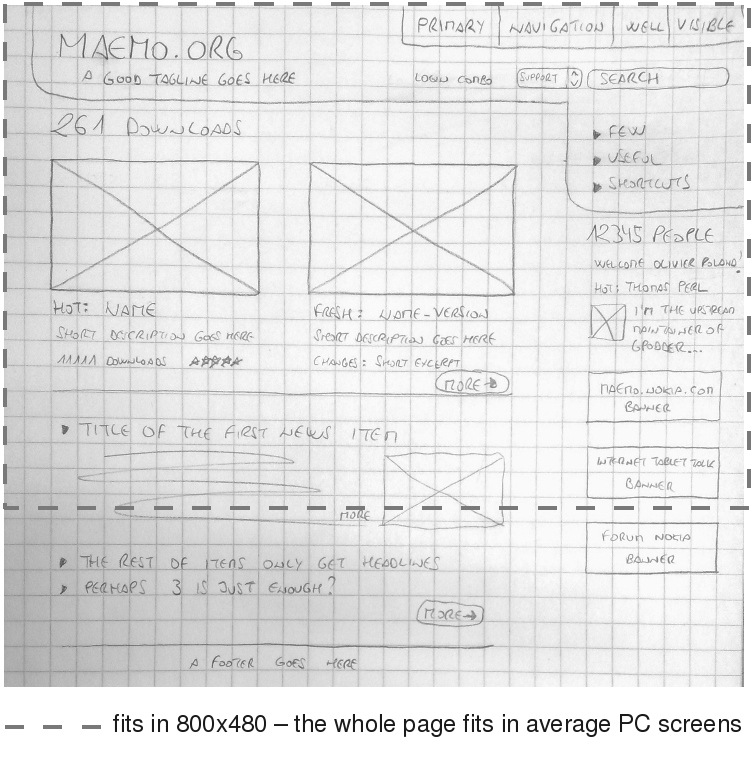
        One question: Does the Search functionality need to be tied to a
pull-down menu or was that just an idea?

        One comment: It's good that the entire page fits 800px wide. I would
also propose that the main content (everything to the left of the
right sidebar) fit into a 700px wide space -- which fits into the
browser when it's not in full-screen mode.

        Last thought: Your idea does not reflect a "fluid" layout in the
true sense, so we should make sure people keep that in mind as they
design.

        I should be able to finish my new design idea within the next couple
of days. (It may not look _exactly_ like what Quim has posted, but it
will contain everything that is present on his design -- in roughly
the same places).

        Tim

        P.S. Thanks for mocking on a grid! :)
 ---
 Weblog ~ http://tim.samoff.com
 Kidblog ~ http://kc.samoff.com
 Photography ~ http://www.flickr.com/photos/timsamoff
 Film ~ http://www.youtube.com/timsamoff
 ----- Original Message -----
 Subject: Re: maemo.org redesign
 From:  Quim Gil
 To: "Tim" ,"List for community development"
 Date: 10/07/2008 2:32 am
 http://wiki.maemo.org/images/1/15/Maemoorg-home-proposal-3.jpg
 - All good ideas taken.
 - Nobody should get overloaded, not even the 770 browser.
 - Perfectly doable with simple & standard code.
 - Content refreshed by the community, no need for manual updates.
 - Flexible: you can improve a module without affecting the whole.
 - All what designers need to work on a beautiful layout.
 - All what writers need to work on final copy.
 --
 Quim Gil
_______________________________________________
maemo-community mailing list
[email protected]
https://lists.maemo.org/mailman/listinfo/maemo-community