Thanks Glaubert!

Some general remarks & questions to kick off discussion:
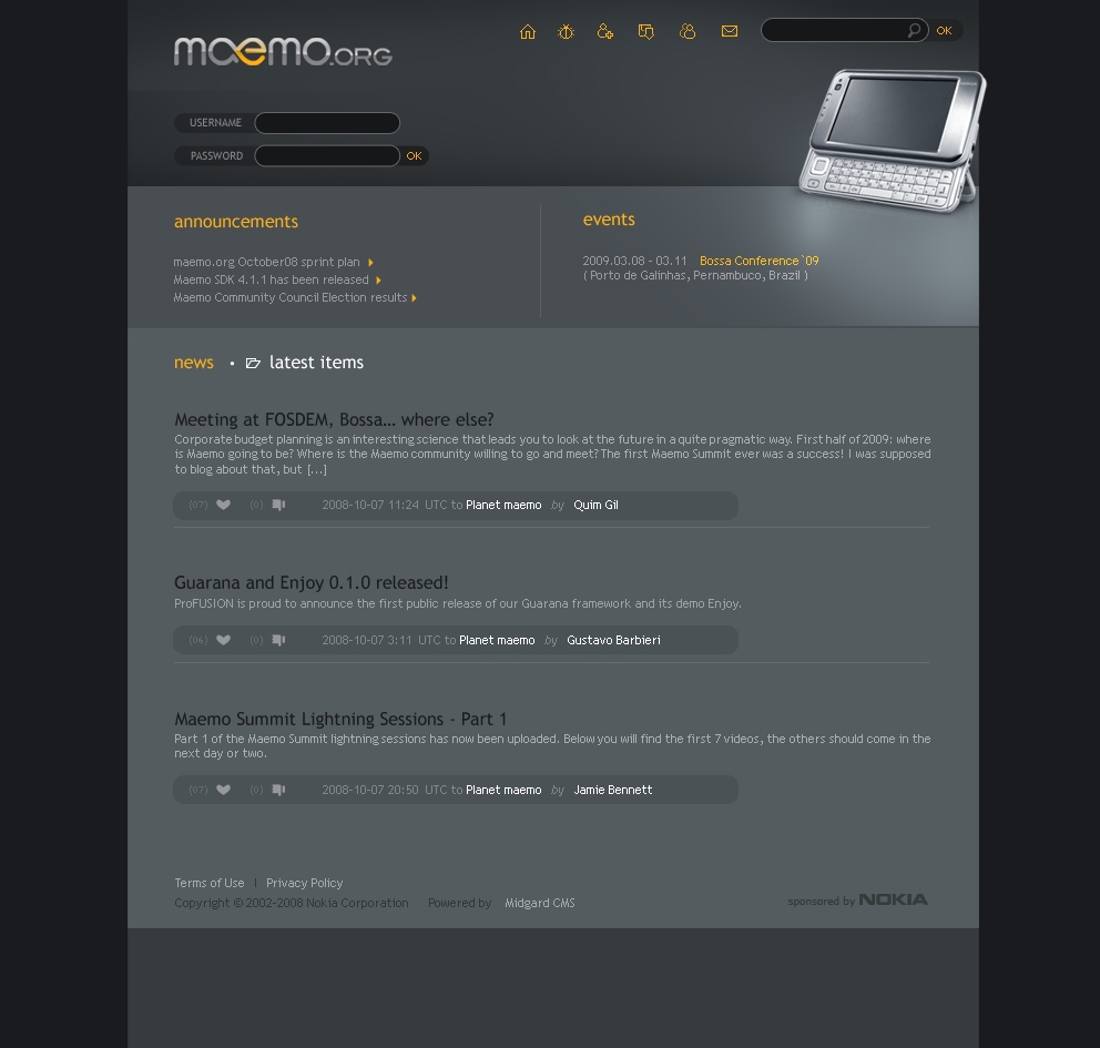
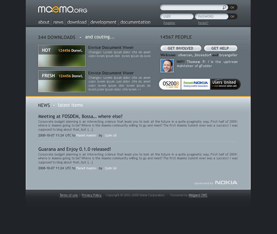
In http://wiki.maemo.org/images/0/09/HOME_05.png

I don't think that the icons at the top work - I don't really know what
they stand for.


In http://wiki.maemo.org/images/1/18/HOME_04.png

I really like the way you've laid out the top - if you think of a
smaller screen, I think it's important that the header not be too big
vertically.

In general, I quite liked the compact arrangement of stuff.

For both designs, though, I have to ask - is there some reason why black
& grey are the only colours proposed yet? I'm not saying we should aim
for orange and red but the logo itself is quite low-key, but the rest of
the design doesn't have to be, does it?

These are only suggestions to start a discussion, not requests for
changes, but I'd really like to hear why you're favouring fairly dark
neutral colours.

Cheers,
Dave.

Glaubert Oliveira wrote:
> Hi everybody!
>
> I was supposed to be posted a proposal yesterday, but i wanted to show
> two new proposal for the Maemo.org site, they were posted at:
>
> http://wiki.maemo.org/Task:Improving_maemo.org#Design_drafts
>
> i`ve made some changes on Tim and Andre`s layout, whith new colors and
> structure, it`s quite similar
>
>
> WIP
>
>
> http://wiki.maemo.org/Image:HOME_04.png -
>
>
> http://wiki.maemo.org/Image:HOME_05.png
>
>
>
>
> ------------------------------------------------------------------------
>
> _______________________________________________
> maemo-community mailing list
> [email protected]
> https://lists.maemo.org/mailman/listinfo/maemo-community

--
maemo.org docsmaster
Email: [EMAIL PROTECTED]
Jabber: [EMAIL PROTECTED]

_______________________________________________
maemo-community mailing list
[email protected]
https://lists.maemo.org/mailman/listinfo/maemo-community