On 20 September 2010 12:02, Thomas Lottmann<[email protected]> wrote:
<[email protected]> wrote:
http://i0.simplest-image-hosting.net/168bf183b2abe8bc9188aacc163dd507/rect10332.png

http://i0.simplest-image-hosting.net/168bf183b2abe8bc9188aacc163dd507/rect13596.png

http://i0.simplest-image-hosting.net/168bf183b2abe8bc9188aacc163dd507/rect13596.png
Because it is currently the best logo I have seen so far, I have a few
suggestions to give it a final shape.

1. Use a white background only for your logo. It must be clear and look good
everywhere it is would be placed and used.
By the way, I really like the shadow, even though it looks a little bit too
low perhaps.

2. A really liked the various colours you applied to the letters previously.
It is really fashionable, and contrasted a little with the serious font you
have chosen, offering an interesting balance between the serious and the eye
candy in the logo.

3. The logo, as an image, is currently limited to the name and it's letters.
There is no icon in the logo that could represent the distribution by
itself. Yet, I do see on your pics some blue bubbles going up on the right.
You should try to replace them by something that would clearly remember the
magic there has always been in the system since Mandrake : flying stars I
would say.
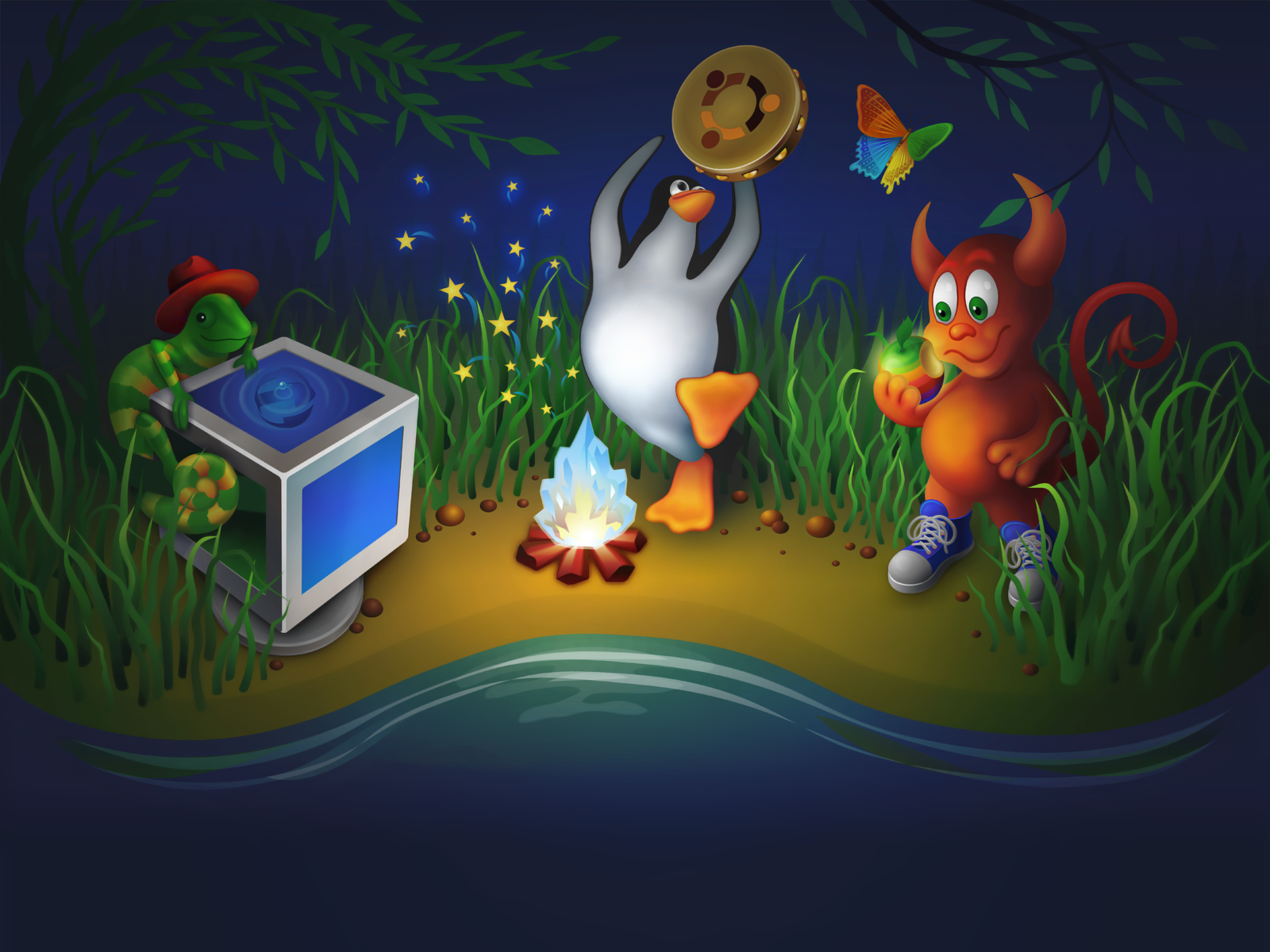
VirtualBox OSE has done a representation of all the major Linux distros,
ours included, but without copying exactly the logos (except for Ubuntu).
You can probably inspire yourself from this :
http://www.virtualbox.org/about_1600px.png

What I mean here is that your logo is, according to me, the most polished
and the one who just feels the best I believe. The only detail missing is
important : the identity to which we have been attached to for so long. Add
the magic in your logo and it should be among the best suggestions for good.
:-)

You will also have to deliver a monochromatic version of your logo, once it
will be finished, once again on a white/transparent background.
Why will he have to do that?
To have clear and clean logos, that could be reusable through these
various formats depending on the use that will be done of them. Some
people prefer working on vectorial formats, other on JPG or PNG. This
works also when integrating it on websites or for reuse in artwork.
Mandriva used to offer it's logos in a .zip folder containing each all
of these files. And I think this is the right thing to do for effective
redistribution and reuse.
_______________________________________________
Mageia-discuss mailing list
[email protected]
https://www.mageia.org/mailman/listinfo/mageia-discuss