1502shivam-singh commented on pull request #495:
URL: https://github.com/apache/apisix-website/pull/495#issuecomment-913615142
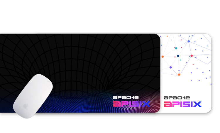
> 1. the first Screen > > I love the left part~! For the right part it is really cool, but not very practical IMO, may I ask whether we can use this cool animation effects only as auxiliary effect? The flow/wavy particle system imagery in top section is more of a metphor to the smooth, frictionless and synchronised performance of APISIX. It's a subtle abstract imagery that I came up with, to pull users in through curiosity and illustrate our product indirectly. Also, I have seen something similar (matching color palletes too) being used in a lot of posters/merchandise of APISIX like in one below, the black hyperloop imagery. Only difference being that one is in motion, other is not. - If you insist, then one way is to change the main heading on left to something that is more descriptive of APISIX in the light of the right imagery.  > 1. The technical architecture of Apache APISIX > > This our [official community chart](https://github.com/apache/apisix/blob/master/docs/assets/images/apisix.png), I noticed that the multiple copies of APISIX has been Ignored in your redraw chart(If my preview address is still correct:https://apisix-re.netlify.app/) > > so how about use this chart directly or make some changes based on the original chart? Oh okay, one naive question coming up, do those multiple layered rectangles actually mean something, when highlighting the high level design ? I am not aware of this so. If they do, then I will edit this graph to accomodate. -- This is an automated message from the Apache Git Service. To respond to the message, please log on to GitHub and use the URL above to go to the specific comment. To unsubscribe, e-mail: [email protected] For queries about this service, please contact Infrastructure at: [email protected]
