JamshedRahman opened a new issue #5955: [SIP-10] Visual Correlation between Charts on a Dashboard URL: https://github.com/apache/incubator-superset/issues/5955 **Use case** On a dashboard, I’m looking at chart A, where there is a spike. I want to see if it happens at the same time as a dip in charts B and C on that dashboard. Suggestion: Hovering over chart A at position X produces a visual indicator (e.g. a vertical line) on all other charts at position X. The tooltip for that position is also displayed with X, Y information for all the charts. This method of showing time correlated events visually will be called Visual Correlation (VC). **Scope** For the initial release of this feature, the following scope is proposed. - Visual Correlation only works between Time Series charts on a dashboard. - Time granularity of the charts should be same e.g. week, day, hour etc. for VC to work. **Mock View** Below is a mock view of VC at work. Note that the 3 time series charts all have the same time granularity (year) and the guide line and tooltip all show up for the same year on all 3 charts. 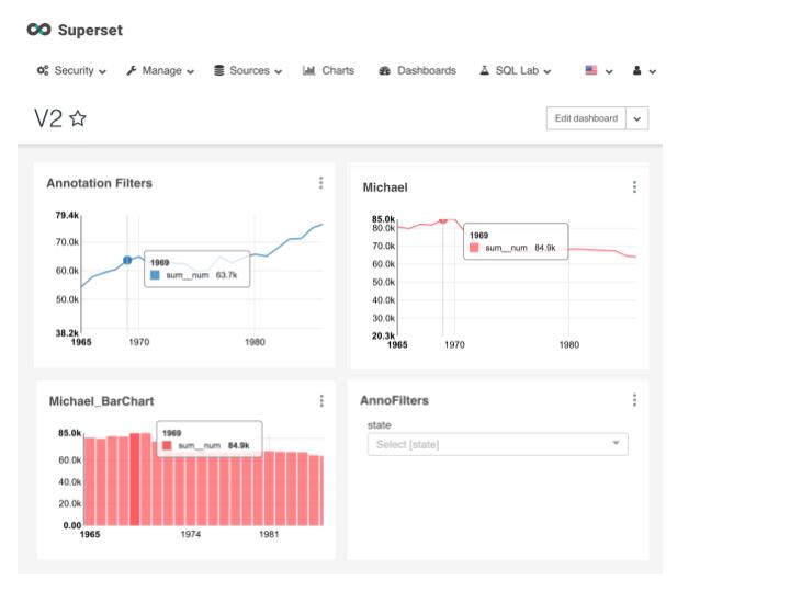 **UI Design** TBD Some things to consider: We probably want a dashboard button that enables/disables VC. **Proposed Architecture** The idea here is to build a bi-directional Chart <---> Dashboard dispatch system. This will be a Publisher-Subscriber architecture, where the source chart (being hovered on) is the publisher, the dashboard is the broker, and the destination charts are the subscribers. A proposed flow of events is outlined below. **Proposed Development** When a mouse is hovered over a specific chart, the elementMousemove event dispatch is triggered and a handler function is called. We will override this dispatch to instead dispatch on a custom mouseMoveHandler function. The custom mouseMoveHandler function calls the original handler function and an additional setHover function with a hoverPosition arg. The setHover function propagates all the way to dashboardState. If we MapStateToProps in ChartContainer.jsx, we can pass hoverPosition state as a prop to Chart.jsx. When a time series Chart receives a change in hoverPosition prop, it will call a renderGuideline function and pass the hoverPosition arg, which will draw the guideline. Additionally time series Charts will also need to enable tooltip and position the tooltip at the correct position with the x,y values. (need to figure out how to do this) **Github working branch** https://github.com/tc-dc/superset/tree/jrahman/VisualCorrelation
----------------------------------------------------------------
This is an automated message from the Apache Git Service.
To respond to the message, please log on GitHub and use the
URL above to go to the specific comment.

For queries about this service, please contact Infrastructure at:
[email protected]


With regards,
Apache Git Services

---------------------------------------------------------------------
To unsubscribe, e-mail: [email protected]
For additional commands, e-mail: [email protected]