kamalkeshavani-aiinside opened a new issue #16109:
URL: https://github.com/apache/superset/issues/16109
## Screenshot 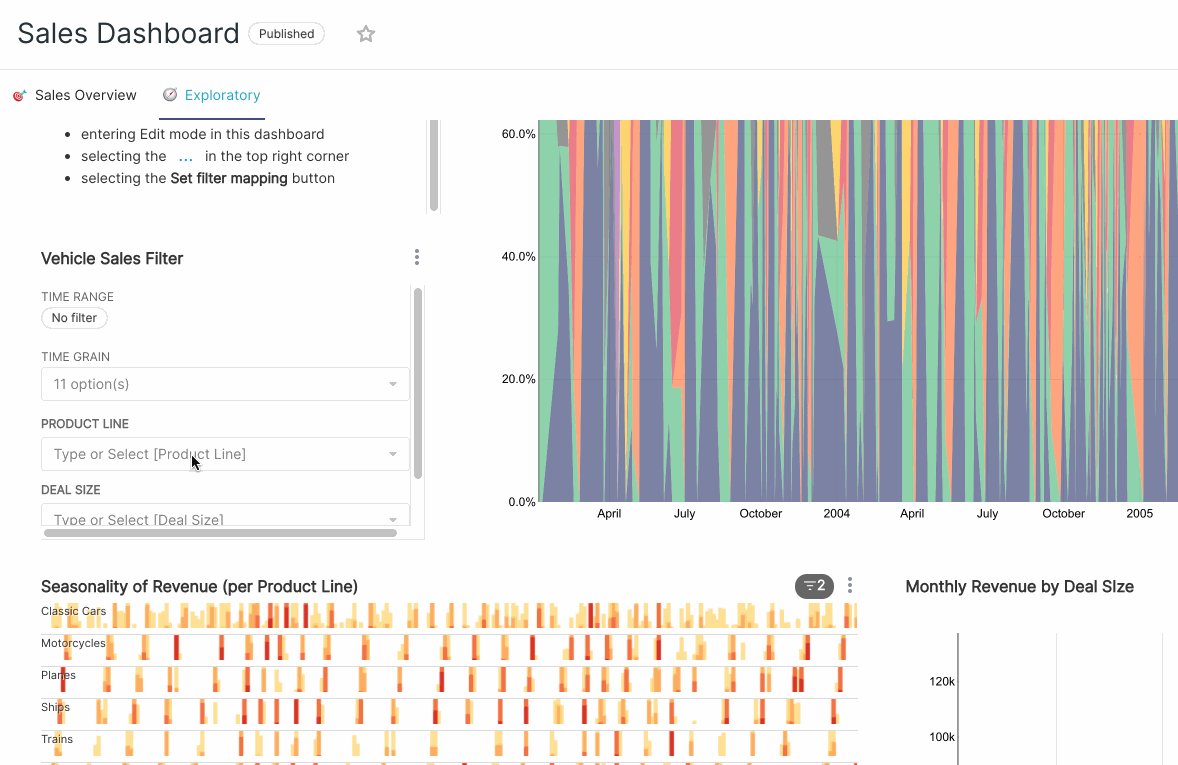 ## Description Usually all filter dropdown have layout above the filter chart in dashboard, making them easy to use and scroll. But In case of Time Grain dropdown, it opens inside the Filter chart box of the dashboard, making it hard to use and scroll. ## Design input I would suggest to keep behavior of Time Grain dropdown same as others. -- This is an automated message from the Apache Git Service. To respond to the message, please log on to GitHub and use the URL above to go to the specific comment. To unsubscribe, e-mail: [email protected] For queries about this service, please contact Infrastructure at: [email protected] --------------------------------------------------------------------- To unsubscribe, e-mail: [email protected] For additional commands, e-mail: [email protected]