kasiazjc opened a new issue #17477:
URL: https://github.com/apache/superset/issues/17477
**Context** When user creates a new chart, after choosing the dataset and the type of the chart they land of the page full of errors which is a bad user experience. There are some metrics that are required, but they should not immediately be shown as errors - when user lands on the page, they should be encouraged and guided to fill in the blanks - not shouted at. 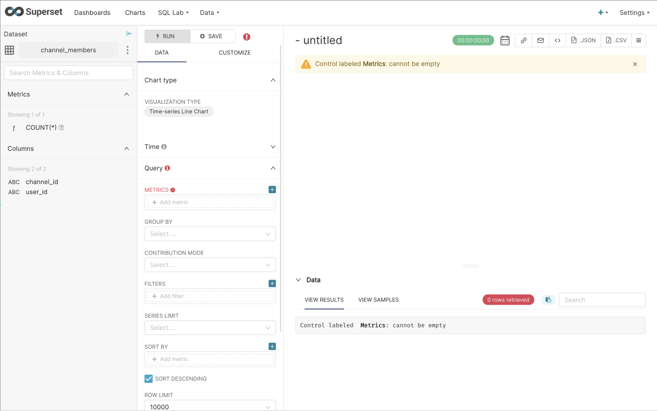 **Describe the solution you'd like** Redesign the experience. Add empty states that guide user through the process. Proposed flow below.   _Requirements_ -> disable the pills with number of rows and time in the right section of explore (data and chart) -> removeerror icons -> add one info icon next to metrics (tooltip) - active (blue) if the metrics field is empty, grayed out when the metrics field is filled, but still can hover over the tooltip -> adda empty state with tips/guide -> highlight all of the fields that are required -> if user adds and removes the value - add red error (current solution) **Additional information** [Flow](https://www.figma.com/file/pjtuSQAGRIu1PE9dYKWaUg/Data-Insights--%3E-Explore?node-id=166%3A34721) [Components](https://www.figma.com/file/pjtuSQAGRIu1PE9dYKWaUg/Data-Insights--%3E-Explore?node-id=141%3A37877) cc: @junlincc -- This is an automated message from the Apache Git Service. To respond to the message, please log on to GitHub and use the URL above to go to the specific comment. To unsubscribe, e-mail: [email protected] For queries about this service, please contact Infrastructure at: [email protected] --------------------------------------------------------------------- To unsubscribe, e-mail: [email protected] For additional commands, e-mail: [email protected]