stephenLYZ commented on pull request #17792:
URL: https://github.com/apache/superset/pull/17792#issuecomment-1046276405
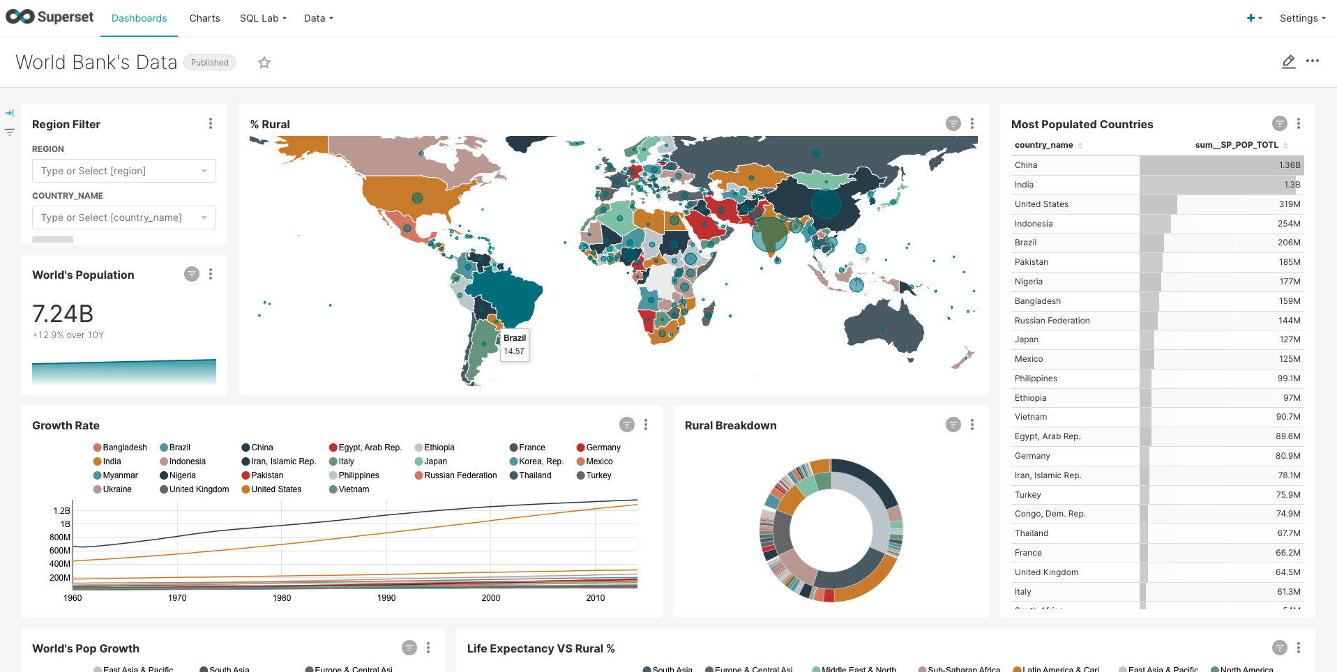
> Hello @stephenLYZ some more comments after another round of testing: > > * In the sample Dashboard "World Bank's Data" I noticed different label colors. I am showing one of the cases in the screenshot. Some other charts seem to work correctly instead within the same Dashboard. FYI this Dashboard has a color scheme and no custom label colors. > > <img alt="Screen Shot 2022-02-16 at 19 19 20" width="1064" src="https://user-images.githubusercontent.com/60598000/154320724-d2faa0cf-335b-4b84-acc7-a53799b590c4.png";> > > This looks so nearly done! I am going to do another code-related review as I think manual testing was pretty awesome so far. Great job! 🚀 🧑🚀 Yes. Here need to add color consistency to the map charts.  -- This is an automated message from the Apache Git Service. To respond to the message, please log on to GitHub and use the URL above to go to the specific comment. To unsubscribe, e-mail: [email protected] For queries about this service, please contact Infrastructure at: [email protected] --------------------------------------------------------------------- To unsubscribe, e-mail: [email protected] For additional commands, e-mail: [email protected]
