rusackas commented on pull request #11418:
URL:
https://github.com/apache/incubator-superset/pull/11418#issuecomment-742902548
For the buttons, you'll want to `import Button from 'src/components/Button';`. Those buttons have a `buttonStyle` prop for those three style variants in the design, e.g. `<Button buttonStyle="link"` From left to right, the button styles are: • Validate: `tertiary` • Cancel: `secondary` • Apply: `primary` (and the `disabled` prop) For all three, you can see they have a particular min-width instead of just using the text width. For that, just add the `cta` prop, i.e. `<Button cta ...` To see (and play with) all the button variants, you can run `npm run storybook` from the `superset-frontend` directory: 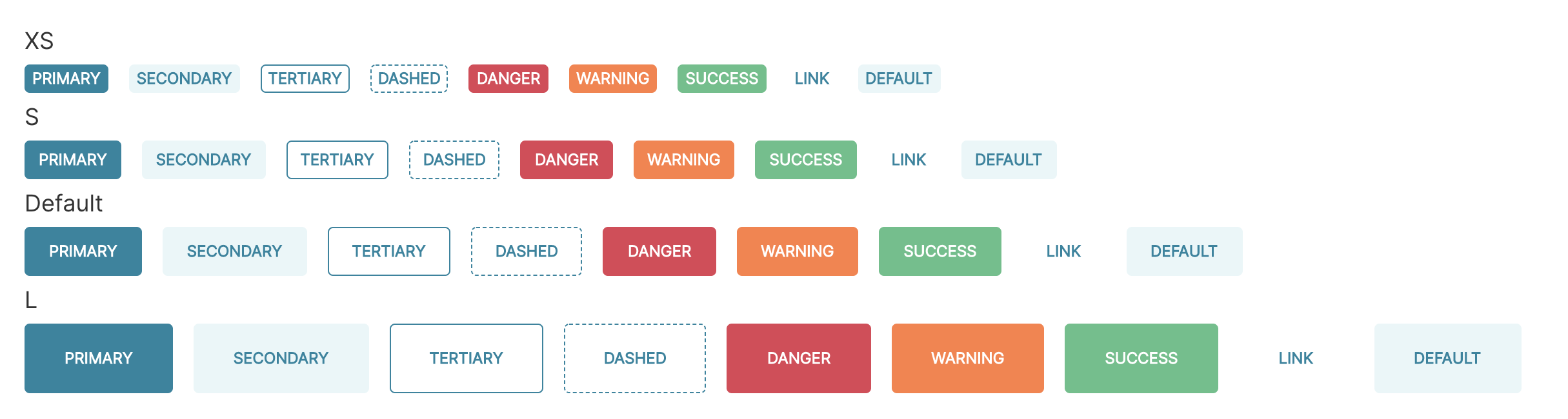 ---------------------------------------------------------------- This is an automated message from the Apache Git Service. To respond to the message, please log on to GitHub and use the URL above to go to the specific comment. For queries about this service, please contact Infrastructure at: [email protected] --------------------------------------------------------------------- To unsubscribe, e-mail: [email protected] For additional commands, e-mail: [email protected]