On 12/12/23 6:10 AM, Mark Raynsford wrote:
I've never been particularly satisfied with the font rendering in
JavaFX.
I looked over the images in your original message. Thank you for taking
the time to run all of these experiments!
I've included my comments below. I opened the images in separate browser
tabs so that I could flip back and forth quickly between each pair.
When enabling hints, the choice of font and the FreeType version start
to matter. The only recommendation from FreeType I found is:
https://freetype.org/freetype2/docs/hinting/subpixel-hinting.html
"PS: I recommend using the Liberation family of fonts (version 2 and
up, important!) instead of Arial, Times New Roman, and Courier. The
family harmonizes much better internally and is equipped with much
better ClearType-ready hinting."
For reference, here's how text rendered at 16px using Terminus TTF
looks today:
https://ataxia.io7m.com/2023/12/12/hinting_nobitmaps_normal.png
I think that link should be:

https://ataxia.io7m.com/2023/12/12/nohinting_nobitmaps_normal.png
That's the current unhinted JavaFX rendering. I guess I'm used to it, so
it doesn't bother me so much, but I admit it does clash with the
slightly-hinted fonts on the rest of my Ubuntu system.
Here's FT_LOAD_RENDER | FT_LOAD_NO_BITMAP (no bitmaps, but using
hinting data):
https://ataxia.io7m.com/2023/12/12/hinting_nobitmaps_normal.png
I can't see the difference. Even if the font has no native hints,
FreeType should be using the auto-hinter for vertical-only hinting.
Maybe you could double-check your "nohinting" and "hinting" screenshots
for the "_nobitmaps_normal.png" images.
That's no real improvement. Here's FT_LOAD_RENDER | FT_LOAD_NO_HINTING
(ignore hinting data, but use bitmaps if they are included):
https://ataxia.io7m.com/2023/12/12/nohinting_bitmaps_normal.png
These are in fact "crisp" with the bitmaps. It's not my preference, but
it is a big difference.
Let's try including both hinting and bitmaps (FT_LOAD_RENDER):
https://ataxia.io7m.com/2023/12/12/hinting_bitmaps_normal.png
As you found, it seems that hinting in this case has no effect when
using bitmaps.
Here's the JavaFX default (FT_LOAD_NO_HINTING | FT_LOAD_NO_BITMAP):
https://ataxia.io7m.com/2023/12/12/droid_12_nohinting_nobitmaps.png
I agree this doesn't look very good at such a small font size.
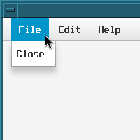
That's pretty nasty. Let's enable hinting (FT_LOAD_NO_BITMAP):
https://ataxia.io7m.com/2023/12/12/droid_12_hinting_nobitmaps.png
Here you can really see the effect of the slight vertical-only hinting.
I see movement between the two images in only the vertical direction,
but those small changes make a difference. Notice that the "F" in File,
the "E" in Edit, and the small "e" all look better.
It's rather subtle, but I think these two images make the case for
allowing hinting in JavaFX, at least on Linux.
For completeness, let's allow bitmaps:
https://ataxia.io7m.com/2023/12/12/droid_12_hinting_bitmaps.png
Droid Sans must not have any bitmaps, so it's the same as before.
Here's the JavaFX default of (FT_LOAD_NO_HINTING | FT_LOAD_NO_BITMAP)
combined with FT_LOAD_TARGET_MONO:
https://ataxia.io7m.com/2023/12/12/droid_12_nohinting_nobitmaps_mono.png
Here, you've removed the anti-aliasing, so I agree it looks bad --
probably the worst of all the images.
However, what happens if we enable hinting?
Here's (FT_LOAD_NO_BITMAP | FT_LOAD_TARGET_MONO):
https://ataxia.io7m.com/2023/12/12/droid_12_hinting_nobitmaps_mono.png
I'm surprised not to see full hinting here. I see only vertical hinting
applied. Maybe the native hinting in the font itself only has vertical
hints at this size?
Amusingly, here's DejaVu Sans at 7pt, (FT_LOAD_NO_BITMAP |
FT_LOAD_TARGET_MONO):
https://ataxia.io7m.com/2023/12/12/dejavu_12_hinting_nobitmaps_mono.png
It looks as if FreeType is now applying the full horizontal and vertical
hinting.
The FreeType API documentation says that full hinting is applied when
using FT_LOAD_TARGET_MONO, but it switches to slight vertical-only
hinting when using FT_LOAD_TARGET_LCD (version 2.8 or later) because it
can triple the horizontal resolution with the subpixel rendering.
The horizontal hinting here, though, destroys the letter spacing in each
of the words. Perhaps the font's native hints aren't very good, it's
using the auto-hinter, or it's just such a tiny font size that the hints
don't have enough pixels to work with.
That, to my eyes, looks pretty good. The JavaFX defaults for the same
font are not good:
https://ataxia.io7m.com/2023/12/12/dejavu_12_nohinting_nobitmaps_normal.png
Here we disagree. At this point size, I'll take no hinting over full
hinting. The main difference between these two images, though, is the
anti-aliasing, not the hinting.
   * Would JavaFX accept patches to allow hinting, bitmaps, and
FT_LOAD_TARGET_MONO?
I guess the only problem with FT_LOAD_TARGET_MONO is that you then
enable all the bad full native hinting found in most fonts. The FreeType
API documentation says:
https://freetype.org/freetype2/docs/reference/ft2-glyph_retrieval.html#ft_load_target_xxx
"Note that for outline fonts, only the TrueType font driver has
proper monochrome hinting support, provided the TTFs contain hints for
B/W rendering (which most fonts no longer provide). If these conditions
are not met it is very likely that you get ugly results at smaller sizes."
Personally, I don't think FT_LOAD_TARGET_MONO is worth the effort when
larger font sizes, better-hinted fonts, and even better monitors are so
readily available. Same goes for the bitmap fonts.
As a first step, I would prefer to have a single property to enable
hinting globally so that people could experiment with that for a year or
so before adding any other complications to the mix. That gives us the
chance to get feedback and build a consensus on possibly, eventually,
changing the default of that single setting.
John