The convention for exiting anything that requires saving is using a
Yes/No/Cancel interaction.
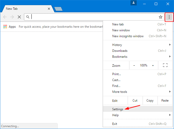
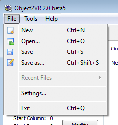
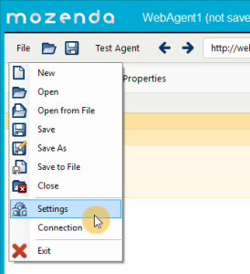
Yes: Exit and save.
No: Exit without saving.
Cancel: Do nothing.

Regards,


Esteban A. Maringolo

On Thu, Jul 4, 2019 at 10:46 AM Ben Coman <[email protected]> wrote:
>
> On Thu, 4 Jul 2019 at 19:37, Torsten Bergmann <[email protected]> wrote:
> >
> > Hi,
> >
> > around 20 days ago the order of menu items in the Pharo world menu were
> > munged up in the standard Pharo 8
> > image for whatever reasons. "Safe" was on first position and not grouped
> > with other "Save ..." items anymore as it was
> > in the past. This was noted by Alexandre Bergel and others on Discord.
> >
> > I fixed the order in the following PULL REQUEST
> > https://github.com/pharo-project/pharo/pull/3529
> > with the menu ending up looking like this:
> >
> >   !--------------------
> >   ! SETTINGS
> >   !--------------------
> >   ! SAVE
> >   ! SAVE AS
> >   ! SAVE AND QUIT
> >   !--------------------
> >   ! QUIT
> >   !--------------------
> >
> > having added by intention an additional divider between
> >  - the more safe options to store the image (secure)
> >  - the unsafe quit where one can loose changes in the image (insecure if
> > you just quit)
> >
> > I know that "SAVE AND QUIT" and "QUIT" also might belong somehow together
> > as both exit the image
> > - but  the diver should separate the more secure options from the more
> > insecure options.
> >
> >
> > Now today the divider was removed again using
> > https://github.com/pharo-project/pharo/pull/3738
> > from Cyril Ferlicot mentioning it as "unwanted" - so now the menu looks
> > like this:
> >
> >   !--------------------
> >   ! SETTINGS
> >   !--------------------
> >   ! SAVE
> >   ! SAVE AS
> >   ! SAVE AND QUIT
> >   ! QUIT
> >   !--------------------
> >
> > as it was back in Pharo 7.
> >
> > As I'm someone who is mousing around very quickly in the past it often
> > happened to me that while I wanted to
> > really "SAVE AND QUIT" I hit accidentally the "QUIT" button directly below
> > - leaving me in a state where I had
> > to recover or reapplying changes afterwards.
> >
> > So using the additonal divider between the three "safe my data" options and
> > the "just leave" was intentional and to
> > me makes some sense: from the point of view of grouping, visually and from
> > clicking behavior.
> >
> > I guess Cyril Ferlicot wanted to restore how it looked in Pharo 7 or had
> > other reasons why he prefers the menu to
> > look like in the second picture.
> >
> > I know it is not a big thing - but nonetheless: It would be good if others
> > could write which option
> >
> >   a) WITH DIVIDER (as in first picture to separate safe from unsafe
> > options) or
> >   b) WITHOUT DIVIDER (as in second picture to stay like it was back in
> > Pharo 7)
>
> Separating dangerous options from the safe options seems a good idea -
> Both for physical jitter and also cognitively.
> Even though Quit presents a confirmation dialog, I've had
> cognitive-fails clicking YES instead of NO**.
> so WITH DIVIDER + 1
>
> Further, I personally use Save much more often than Settings.
> I'd prefer Save on the top line and Settings above Quit
> I advocated this prior to midway through Pharo 7 but got no response.
> It would provide even greater separation.
>
> Some Settings menu-item placement examples...
> https://www.top-password.com/blog/wp-content/uploads/2017/04/chrome-menu.png
> https://ntopology.com/wp-content/uploads/2019/01/FileMenu.png
> https://ggnome.com/wiki/images/d/d6/FileMenuWin.png
> https://www.mozenda.com/wp-content/uploads/2016/01/AgentBuilder-File-Settings-CursorHighlight-Arrow-274x300.png
>
> cheers -ben
>
>
> **P.S.  I'm generally opposed to YES/NO buttons.  Its easy to invert
> logic when your in a hurry.
> A confirmation dialog QUIT/STAY is much more explicit.
> Rule #1 ==>
> https://uxmovement.com/buttons/5-rules-for-choosing-the-right-words-on-button-labels/
>