Now I really want an android/iphone app to go with the square version!

On Wed, Aug 1, 2012 at 7:48 AM, Alessandro D' Aquino <[email protected]
> wrote:
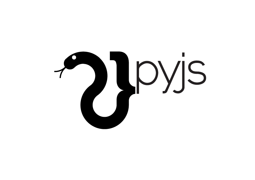
>
> Hi,
>
> On Wednesday, August 1, 2012 7:58:10 AM UTC+2, peter.bittner wrote:
>>
>> Hi all,
>>
>> very, very nice work, Alessandro! Bellissimo!
>>
>
> Peter, mille grazie :)
>
>
>>
>> Just some thoughts (be)for(e) bringing this online:
>>
>>    1. *Squared logo version:* Usually, when you have a logo there should
>>    be a *roughly squared* (n:n) *version*, which is easier to use --
>>    think of profile pictures, avatars, website logos in the top left corner,
>>    etc.
>>    How do we solve that? (Just omit the "pyjs"? Split up the "py" and
>>    "js", and place it one on top of the other? Rotate the "pyjs" by 90
>>    degrees? ...)
>>
>> Good point! Since the logo is high metaphoric, I think omitting the
> "pyjs" would be a good option. The pure emblematic shape would be used. To
> undermine what I mean I just made up quickly an iPhone App Icon (It's of
> course ironically ment :) to see the logo in action without the "pyjs", I
> think the shape alone has the necessary features to be easy recognizable.
>
>
> <https://lh4.googleusercontent.com/-rRThAwnOoNc/UBk_yqHQlrI/AAAAAAAAAKA/Veo54xkrkG8/s1600/iphone_icon.png>
>
>
>
>
>>
>>    1. *pyjs vs. Pyjs:* The current design suggests that "*pyjs*" (all
>>    small caps) is the preferred version of spelling. We should agree on
>>    whether this is what we want, or whether "*Pyjs*" (camel case) is the
>>    preferred version. As soon as something is part of a logo it written law.
>>
>> Personally I prefer "pyjs" before: Pyjs, PyJS or PYJS, simply because the
> lowercase letters are more geometrically "quiet" and don't steal the
> attention of the main logo shape. But this is my personal opinion as always.
>
>
>
>>
>>    1. *Shadow:* I believe the shadow is not final, right? Just thinking,
>>    if a shadow goes into a (larger sized) version of the logo it should be
>>    *real(istic)*, i.e. a *drop shadow* of the logo and the writing. I
>>    think. Not being a designer myself. (Ignore this if it is ignorant
>>    bullshit! :-) )
>>
>> You are completely right!
> No, the shadow is not part of the logo (neither is the light circular
> gradient around the logo) all stuff beside the logo was only for "logo
> presentation" purposes, to let things clear the logo is what follows :)
>
>
> <https://lh4.googleusercontent.com/-WxqXAEJOGQw/UBlAn2i7pfI/AAAAAAAAAKI/4zHpdSIN8sc/s1600/pyjs_logo_small_font.png>
>
>
>
>
> Cheers,
> Alex
>
>
>
>> Cheers,
>> Peter
>>
>>
>> 2012/7/28 Alessandro D' Aquino
>>
>>>
>>> Hi Anthony,
>>> after some reshaping here is now the new version of the logo.
>>>
>>> The snake head is now at 45º from the original position, this is the
>>> sweet spot I think, look at the "s" from "js" the "s" shape is like the
>>> horizontally mirrored snake silhouette, this detail could mean that still
>>> in the converted javascript is the soul of the python snake ;)
>>>
>>> The font I used for the "pyjs" is this one (http://www.google.com/**
>>> webfonts/specimen/Raleway<http://www.google.com/webfonts/specimen/Raleway>),
>>> it is very similar to the designer workhorse Helvetica... but free!
>>> I've also traced down the font and modified slightly the shape, just to
>>> have something that is unique :)
>>>
>>> Here we go, have a look.
>>>
>>> <https://lh3.googleusercontent.com/-RIz635GGTZI/UBPylE_XrpI/AAAAAAAAAJw/aAWGBTR0ff0/s1600/pyjs_logo-04.png>
>>>
>>>
>>> I have also removed the tagline, because it is not part of the logo I
>>> think, but it can be added in the website later or where ever the logo is
>>> used,
>>>
>>>
>>> On Friday, July 27, 2012 6:27:48 AM UTC+2, C Anthony Risinger wrote:
>>>
>>>> On Tue, Jul 24, 2012 at 1:10 PM, Alessandro D' Aquino wrote:
>>>> >
>>>> > Here a simple comparison ...
>>>>
>>>> hmm .. i kinda like the compactness of the "top snake" ... sweet spot
>>>> is prob somewhere in between (might add some nice angular lines too).
>>>>
>>>> i'm also starting to think that fatty font doesn't look as good or
>>>> contrast as well as your original ... what are some nice SANS or
>>>> monospace fonts? "Just Say No" to Serif (and drugs too i guess).
>>>>
>>>
>>> as for contributing, we'll likely do a simpl on-list poll -- if you
>>>> could send me the SVG files that would be fantastic --
>>>
>>>
>>> I'll wait with the SVG until the final shape is concretized ok?
>>>
>>>
>>>> i will ensure
>>>> your name is correctly set in the "Authors" field if/when it's
>>>> committed.
>>>>
>>>>
>>> i also like the mocked site you made, very sleek.  i'm no designer, so
>>>> i have trouble creating comps; i do 100% backend Python now but in a
>>>> past life i used to slice up such images into real websites -- any
>>>> assets/comps/PSD/whatever you'd like to provide there would also be
>>>> much appreciated.  as you (thus far) have been the primary force here,
>>>> i'd also ensure you'd have a public place to point references in the
>>>> end ;-)
>>>>
>>>>
>>> as for the comps, the image I posted is made in Photoshop, but the
>>> menubar, the buttons and the layout is mostly Twitter bootstrap components (
>>> http://twitter.github.com/**bootstrap/<http://twitter.github.com/bootstrap/>,
>>> http://twitter.github.com/**bootstrap/examples.html<http://twitter.github.com/bootstrap/examples.html>)
>>> and this free icon set (http://dryicons.com/free-**
>>> icons/preview/stylistica-**icons-set/<http://dryicons.com/free-icons/preview/stylistica-icons-set/>),
>>> the rest is dummy text - but it will not help you much I think, because
>>> it's a mess of overloaded layers and cuttet screenshots for a quick proof
>>> of concept :) but If you want the psd file, no problem!
>>>
>>> thanks!
>>>>
>>>> --
>>>>
>>>> C Anthony
>>>>
>>>
>>> Thanks!
>>> Alex
>>>
>>>
>>> --
>>>
>>>
>>>
>>>
>>
>>   --
>
>
>
>

--