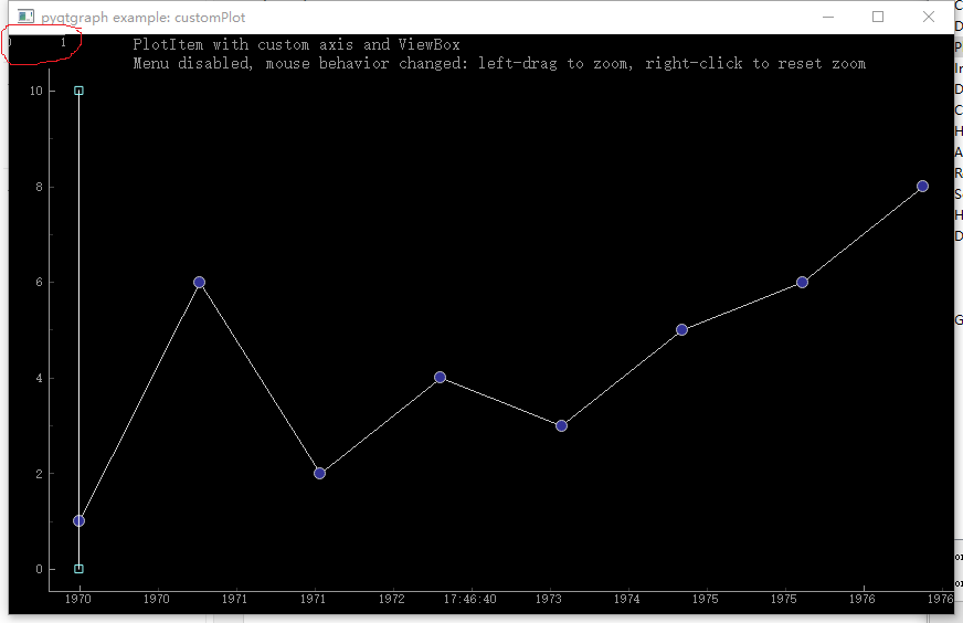
<https://lh3.googleusercontent.com/-UtC49O94cN4/V4RYCrwkePI/AAAAAAAAACI/e2zHrsouzT0nkRvbxMfkD0yLP6gmsxh2QCLcB/s1600/plot_customization.png>
hi, everyone, I am new to pygraph, and when i customize my plotwidget i
find something that confuse me very much. I follow the example tutorial to
customize my own, and the confusion is there too in the example.
See the following screen-shot. I am confused that what is that in the red
circle, is that a map scale or something like that? how can I hide that?
why there is no that thing when i do not customize
the bottom axis?
Thanks a lot?
--
You received this message because you are subscribed to the Google Groups
"pyqtgraph" group.
To unsubscribe from this group and stop receiving emails from it, send an email
to [email protected].
To view this discussion on the web visit
https://groups.google.com/d/msgid/pyqtgraph/4ec3830e-f53e-4805-9868-50fdb5156c94%40googlegroups.com.
For more options, visit https://groups.google.com/d/optout.