Hi,

It probably seems strange to me (and Marco), as this is my everyday map
and I have a totally different association than QGIS to this.
But as there is not much response to this, I guess there are not many
concerns around.
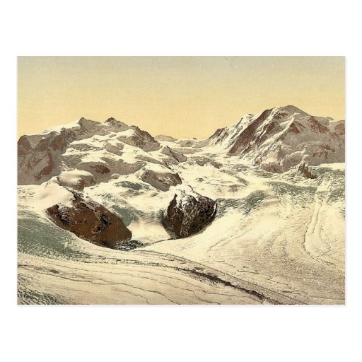
As a reminder concerning the swisstopo map, we are also not allowed to
use this at a resolution exceeding 500'000 pixels.
The picture with the Hotel Schwarzsee which Marco cited is also
available at a higher resolution (to some extent at the expense of some
blurryness) [1]

Regards,
Matthias

[1]
http://upload.wikimedia.org/wikipedia/commons/5/5c/Monte_Rosa_and_Hotel_Schwarzsee%2C_Valais%2C_Alps_of%2C_Switzerland.jpg

On Sam 31 Aug 2013 15:04:50 CEST, Anita Graser wrote:
> Hi Matthias,
>
> Thank your four raising these points.
>
> Am 31.08.2013, 13:04 Uhr, schrieb Matthias Kuhn <[email protected]>:
>> However, I'm still not really convinced of using a background of a
>> modern (admittedly visually appealing) map service which has no
>> relation to and is by no means produced with the help of QGIS.
>
> I understand your concern but I'm not sure how big an issue it would be.
> In my opinion, the design is very artistic and clearly not a result which
> could be achieved directly in a QGIS but which requires serious
> cartographic skill.
>
> As a reference, here is the design with the old black-and-white map
> http://www.flickr.com/photos/48244569@N02/9637382664/
>
>> I was looking for other
>> images, which are not maps, but nevertheless artistic work with spatial
>> nature and cannot be mistaken (at least I believe so) to be a result of
>> QGIS.
>> So here some pictures I found
>
> Sorry, but none of those are an option in my opinion. I think they look
> very dull and I would not like to look at them every day. On the
> technical
> side, they are of very low resolution and some blurry. I would like to
> see
> the splash screen design reflected on the new website as well, so the
> material should work at different resolutions.
>
> I'm open to try different background maps of the agreed region but they
> should be available in a reasonable resolution.
>
> Best wishes,
> Anita
>
>
>
>
>>
>> http://commons.wikimedia.org/wiki/File:Monte_Rosa_and_Hotel_Schwarzsee,_Valais,_Alps_of,_Switzerland.jpg
>>
>> http://www.festivaltour.de/forum/attachment.php?attachmentid=4817&d=1358685981
>>
>> http://www.gemeinschaftskatalog.de/GK/stra/Bilder/435%20Nolde-Dufour.jpg
>> http://rlv.zcache.de/monte_rosa_lyskamm_mit_gorner_gletscher_wallis_postkarte-r81b50da849b8458b9a2aa7b91bd5120f_vgbaq_8byvr_512.jpg
>>
>> http://www.historisches-alpenarchiv.org/data/bilder/web/143/00109153_w.jpg
>>
>>
>> I'm not sure about the rights we have to get to use them, but they are
>> ancient, so I guess that should not be a problem?
>>
>> Matthias
>>
>> On Sam 31 Aug 2013 12:31:28 CEST, Anita Graser wrote:
>>> Hi,
>>>
>>> It's time to get the splash ready. This thread seems to agree with the
>>> general direction of the drafts Nathan posted. I've therefore prepared
>>> three variants of the design:
>>>
>>> http://www.flickr.com/photos/48244569@N02/9633228465/in/photostream/
>>> http://www.flickr.com/photos/48244569@N02/9633228767/in/photostream/
>>> http://www.flickr.com/photos/48244569@N02/9633228881/in/photostream/
>>>
>>> Please use the star feature to vote on the design(s) you prefer and
>>> leave comments on the image page if you think something should be
>>> changed. I'll check all the feedback and create the final version on
>>> Sunday evening (Sept 1st, CEST).
>>>
>>> Best wishes,
>>> Anita
>>>
>>>
>>>
>>>
>>> Am 23.07.2013, 09:35 Uhr, schrieb Tim Sutton <[email protected]>:
>>>
>>>> Hi
>>>>
>>>> My 2c below:
>>>>
>>>> On Mon, Jul 22, 2013 at 6:29 PM, Larry Shaffer
>>>> <[email protected]>wrote:
>>>>
>>>>> Hi,
>>>>>
>>>>> On Tue, Jul 16, 2013 at 6:57 PM, Nathan Woodrow
>>>>> <[email protected]>wrote:
>>>>>
>>>>>> Here is a version with the green but also the full logo:
>>>>>>
>>>>>> https://www.dropbox.com/s/u6bj807cesttnwl/qgis_green3.png
>>>>>>
>>>>>
>>>>> +1, I think the layout and color selection are good. The layout
>>>>> doesn't
>>>>> include that dark grey border, does it? If so, please consider
>>>>> removing it.
>>>>>
>>>>>
>>>> I think the Q logo should be smaller, say 1/3 the splash hight and
>>>> nestled
>>>> into the top left corner (with some white space around it) and with no
>>>> transparency.
>>>>
>>>>
>>>>> Also, the font used for 'QGIS' is rather weak and, to be frank, a bit
>>>>> goofy-looking (especially the Q). I have a huge assortment of
>>>>> professional
>>>>> fonts which I can work with to find something better.
>>>>>
>>>>
>>>> Agreed - though can you please use a font that is free or at  least
>>>> easily
>>>> available and provide the final splash as a gimp xcf so that we can
>>>> easily
>>>> re-use it in future releases.
>>>>
>>>>
>>>>>
>>>>> Nathan, do you have a working design file I can use? Or at least a
>>>>> background PNG without the lettering?
>>>>>
>>>>> There appears to be no leading between the lines 'QGIS 2.0' and
>>>>> 'Dufour,'
>>>>> nor spacing between 'QGIS' and '2.0.' Was this intended? I do kind
>>>>> of like
>>>>> the effect, however. Usually when this is done in design, at
>>>>> minimum, the
>>>>> coloring of the two words/lines is different, even if just a
>>>>> difference in
>>>>> tone of the same color.
>>>>>
>>>>>
>>>> I agree with this, it needs a little more white space between the
>>>> words.
>>>>
>>>> Also a note that we usually store the master splash in  much higher
>>>> resolution so that it can be used in posters / printed products etc. A
>>>> downsampled one is then used for the final splash. Ideally in future
>>>> releases we would just swap out the background image and edit the text
>>>> containing the version and name.
>>>>
>>>> Regards
>>>>
>>>> Tim
>>>>
>>>> Regards,
>>>>>
>>>>> Larry
>>>>>
>>>>>
>>>>>
>>>>>>  - Nathan
>>>>>>
>>>>>>
>>>>>> On Wed, Jul 17, 2013 at 1:18 AM, Marco Bernasocchi <
>>>>>> [email protected]> wrote:
>>>>>>
>>>>>>> On 07/16/2013 03:02 PM, Matthias Kuhn wrote:
>>>>>>>
>>>>>>>  Currently, all splash screen drafts I have seen are heavily
>>>>>>> based on
>>>>>>>> swisstopo maps. While I personally like these very well-done
>>>>>>>> maps, I
>>>>>>>> don't see the connection between these and QGIS. For me, looking
>>>>>>>> at the
>>>>>>>> splashes feels like looking at a swisstopo advertisement.
>>>>>>>> I would prefer a version, where we show off the new features of
>>>>>>>> QGIS
>>>>>>>> and/or having a historical map instead of just showing a standard
>>>>>>>> product of the official Swiss map-makers.
>>>>>>>>
>>>>>>>
>>>>>>> I agree with Matthias, and I'll suggest again (as Andreas did
>>>>>>> before) to
>>>>>>> try the dufour map:
>>>>>>> http://s.geo.admin.ch/**09751c84f<http://s.geo.admin.ch/09751c84f>or
>>>>>>>
>>>>>>> maybe the sigfriedkarte
>>>>>>>
>>>>>>> ciao
>>>>>>>
>>>>>>>
>>>>>>>
>>>>>>> --
>>>>>>> Marco Bernasocchi
>>>>>>> http://opengis.ch
>>>>>>> ______________________________**_________________
>>>>>>> Qgis-developer mailing list
>>>>>>> [email protected]
>>>>>>> http://lists.osgeo.org/**mailman/listinfo/qgis-**developer<http://lists.osgeo.org/mailman/listinfo/qgis-developer>
>>>>>>>
>>>>>>>
>>>>>>>
>>>>>>
>>>>>>
>>>>>> _______________________________________________
>>>>>> Qgis-developer mailing list
>>>>>> [email protected]
>>>>>> http://lists.osgeo.org/mailman/listinfo/qgis-developer
>>>>>>
>>>>>>
>>>>>
>>>>> _______________________________________________
>>>>> Qgis-developer mailing list
>>>>> [email protected]
>>>>> http://lists.osgeo.org/mailman/listinfo/qgis-developer
>>>>>
>>>>>
>>>>
>>> _______________________________________________
>>> Qgis-developer mailing list
>>> [email protected]
>>> http://lists.osgeo.org/mailman/listinfo/qgis-developer
>>
>>
>
>


_______________________________________________
Qgis-developer mailing list
[email protected]
http://lists.osgeo.org/mailman/listinfo/qgis-developer