Hello,

I am quite new to R and have high expectations for my future with it.
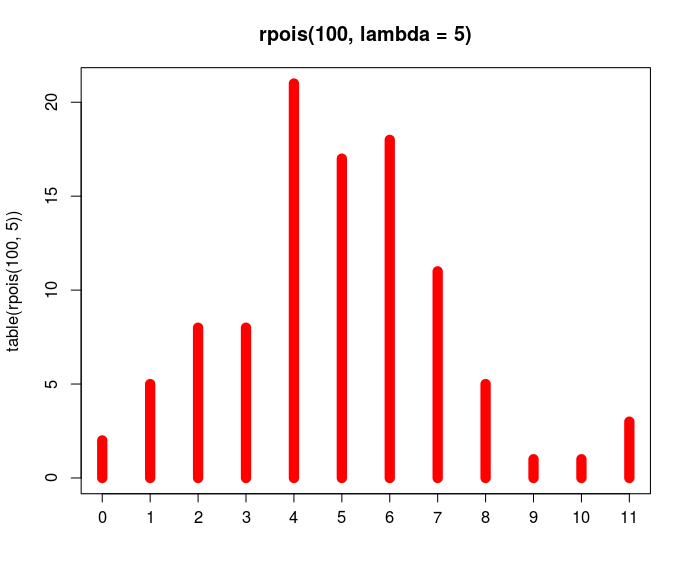
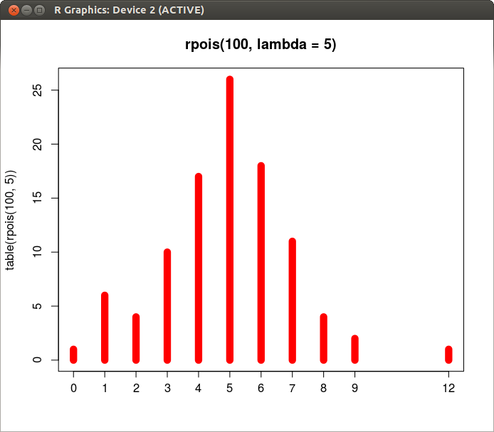
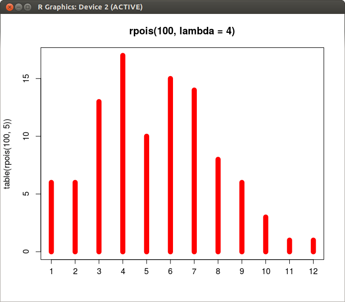
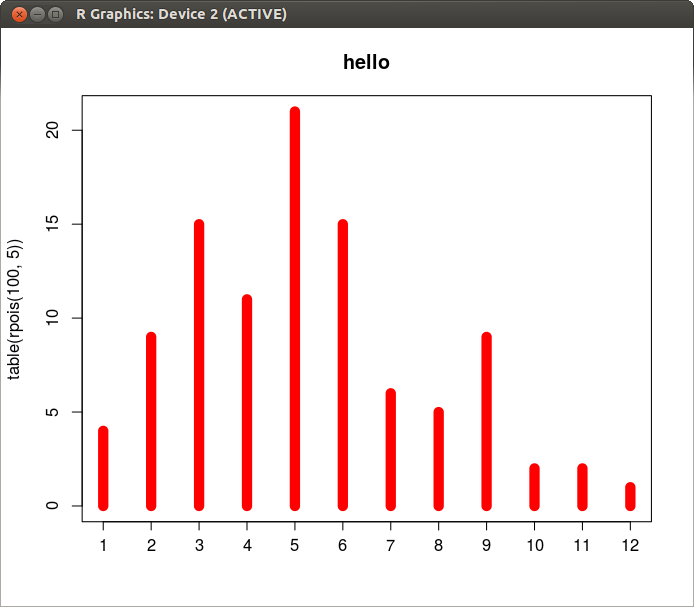
R version 3.0.2 (2013-09-25) -- "Frisbee Sailing"
Copyright (C) 2013 The R Foundation for Statistical Computing
Platform: x86_64-pc-linux-gnu (64-bit)

I have stepped back to an earlier tutorial and found an odd inconsistency
with one of the examples:

plot(table(rpois(100, 5)), type = "h", col = "red", lwd = 10, main =
"rpois(100, lambda = 5)")

I read the local documentation on the plot command and it's arguments.
>From that, I learned that 'main' defines the title from a text string.  I
decide to modify some values to see how the resulting behavior changes.
What I didn't expect was that modifying the text string caused the chart
to change greatly.

plot(table(rpois(100, 5)), type = "h", col = "red", lwd = 10, main =
"rpois(100, lambda = 4)")

With the previous line, the columns change values.

plot(table(rpois(100, 5)), type = "h", col = "red", lwd = 10, main = "hello")

This line even adds a 12th column.

I return to plot the original and the output has changed again.   Here are
some screenshots

http://timothylegg.com/R/lambda5_.png
http://timothylegg.com/R/lambda5.png
http://timothylegg.com/R/lambda4.png
http://timothylegg.com/R/hello.png

What am I doing wrong to get inconsistent results like this?  I'm very new
to R and really hoping that this is a misunderstanding on my part.

______________________________________________
R-help@r-project.org mailing list -- To UNSUBSCRIBE and more, see
https://stat.ethz.ch/mailman/listinfo/r-help
PLEASE do read the posting guide http://www.R-project.org/posting-guide.html
and provide commented, minimal, self-contained, reproducible code.