Hi Christopher,
Thanks for the reply. Your comments are helpful.

I agree with you about relative position in relation to geography.
The thing with this particular circular graph is it speaks to the
executive ranks a bit more than a bar or line graph.
Kindest Regards,
*Stephen Dawson, DSL*
/Executive Strategy Consultant/
Business & Technology
+1 (865) 804-3454
http://www.shdawson.com


On 5/29/22 22:10, Christopher W. Ryan via R-help wrote:
If the units of analysis are real spatial regions (e.g. states), how
about a cartogram?
https://gisgeography.com/cartogram-maps/
An R package (I have no experience with it)
https://cran.r-project.org/web/packages/cartogram/index.html
The advantage of a cartogram is that it is a single graphic, rather than
2 like the original post referenced. No need to move eye back and forth
to decode the colors. And it maintains---as much as possible given the
distortion, which is the whole point of a cartogram--- the relative
spatial positions of the areal units (in this case, states.) The round
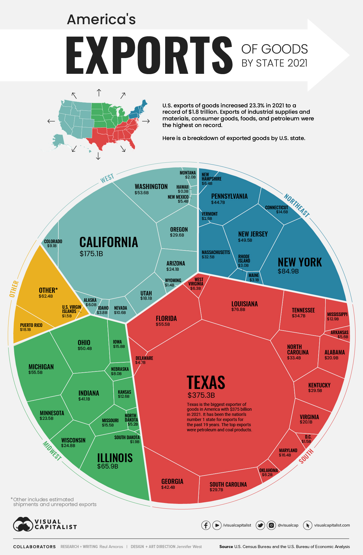
figure in the original post has the northern midwestern region in the
7:00 to 8:00-ish position, what might be considered notionally the
"southwest." A little counterintuitive.
--Chris Ryan
Bert Gunter wrote:
Very nice plot. Thanks for sharing.
Can't help directly, but as the plot is sort of a map with polygonal
areas encoding the value of a variable, you might try posting on
r-sig-geo instead where there might be more relevant expertise in such
  things -- or perhaps suggestions for alternative visualizations that
work similarly.

Bert Gunter

"The trouble with having an open mind is that people keep coming along
and sticking things into it."
-- Opus (aka Berkeley Breathed in his "Bloom County" comic strip )

On Sat, May 28, 2022 at 8:39 AM Stephen H. Dawson, DSL via R-help
<r-help@r-project.org> wrote:
https://www.visualcapitalist.com/us-goods-exports-by-state/
Visualizing U.S. Exports by State

Good Morning,


https://www.visualcapitalist.com/wp-content/uploads/2022/05/us-exports-by-state-infographic.jpg

Saw an impressive graph today. Sharing with the list.

The size proportionality of the state segments in a circle graph is catchy.

QUESTION
Is there a package one could use with R to accomplish this particular
circular-style graph?


Kindest Regards,
--
*Stephen Dawson, DSL*
/Executive Strategy Consultant/
Business & Technology
+1 (865) 804-3454
http://www.shdawson.com

______________________________________________
R-help@r-project.org mailing list -- To UNSUBSCRIBE and more, see
https://stat.ethz.ch/mailman/listinfo/r-help
PLEASE do read the posting guide http://www.R-project.org/posting-guide.html
and provide commented, minimal, self-contained, reproducible code.