Not sure if there are any 'recommended' visualisations, but the following is
a start (you will need to tune the scaling of the x-axis label and state
identifiers).
In the plot produced, the widths of the 'columns' are proportional of
purchases occurring in the state, and the height of the 'boxes' are
proportional to the purchases occurring in the County - hence the area of
each box represents the proportion of total (i.e. national) sales occurring
in the County.
#generate some random data
n <- 100
dat <- data.frame(
State=(tmp <- sample(LETTERS, n, T)),
County=paste(tmp, 1:n, sep=''),
Purchases=floor(rnorm(n, 100, 20))
)
# draw the plot
split.dat <- split(dat, dat$State)
widths <- sapply(split.dat, function(x) sum(x$Purchases))
widths <- widths / sum(widths)
cum.widths <- c(0.0, cumsum(widths)[-length(widths)])
plot(0:1, 0:1, type='n', xaxt='n', yaxt='n', xlab='', ylab='')
par(usr=c(0,1,0,1), xpd=NA)
mapply(function(x, cum.tot, width) {
heights <- x$Purchases / sum(x$Purchases)
cum.heights <- c(0.0, cumsum(heights)[-length(heights)])
mapply(function(y, height, x, width) rect(x, y, x+width, y+height),
cum.heights, heights, MoreArgs=list(cum.tot, width))
text(cum.tot + width/2, heights/2 + cum.heights, x$County)
}, split.dat, cum.widths, widths)
axis(1, (widths / 2 + cum.widths), names(split.dat))
Hope this helps,
Simon Knapp
On Wed, Jan 13, 2010 at 2:46 PM, Rex C. Eastbourne <[email protected]
> wrote:
> On Tue, Jan 12, 2010 at 5:26 PM, Rex C. Eastbourne <
> [email protected]
> > wrote:
>
> > Let's say I have data in the following schema that describes the number
> of
> > purchases a company has received from each County in the US:
> >
> > State | County | Purchases
> > ---------------------------------------
> > NJ | Mercer | 550
> > CA | Orange | 23
> > ....
> >
> > I would like to visualize what states contribute the most to the overall
> > total, and furthermore within those states, what Counties contribute the
> > most. What are some recommended R visualizations for this type of data? I
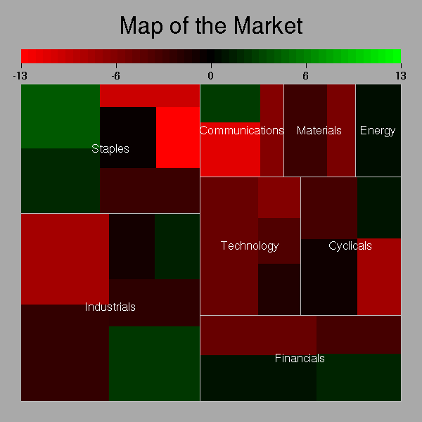
> > created a treemap using map.market from the portfolio library, like the
> > following:
> >
> > http://zoonek2.free.fr/UNIX/48_R/g126.png
> >
> > Although this is an attractive visual, I want something that makes it
> > easier to compare the relative sizes of components at a glance (hard with
> a
> > treemap because rectangles have different aspect ratios). Does anyone
> have a
> > recommended alternate visualization?
> >
> > Thanks!
> >
>
> Just to clarify: I made up the above example for simplicity's sake to
> illustrate what I meant by "hierarchical" data. My actual data is not
> related to maps or geography, so a map-based visualization wouldn't work.
>
> [[alternative HTML version deleted]]
>
> ______________________________________________
> [email protected] mailing list
> https://stat.ethz.ch/mailman/listinfo/r-help
> PLEASE do read the posting guide
> http://www.R-project.org/posting-guide.html
> and provide commented, minimal, self-contained, reproducible code.
>
[[alternative HTML version deleted]]
______________________________________________
[email protected] mailing list
https://stat.ethz.ch/mailman/listinfo/r-help
PLEASE do read the posting guide http://www.R-project.org/posting-guide.html
and provide commented, minimal, self-contained, reproducible code.