Not sure if I am missing something essential here but it would
seem as simple as:
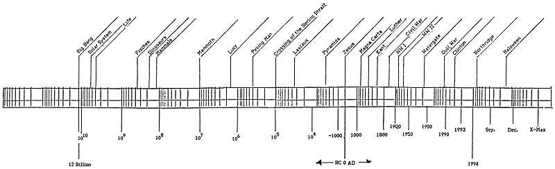
# data
set.seed(1)
x <- runif(500, 1500, 1990)

# plot
d <- density(x, from = 1500, to = 1990)
plot(d$y ~ d$x, log = "x")
rug(x)
axis(1, seq(1500, 1990, 10), FALSE, tcl = -0.3)


On 7/6/05, Michael Friendly <[EMAIL PROTECTED]> wrote:
> Thanks Duncan,
> That is almost exactly what I want, except I want time to
> go in the normal order, not backwards, so:
>
> # plot on reverse log scale
> years1500 <- runif(500, 1500, 1990)  # some fake data
> x <- -log(2000-years1500)
> from <- -log(2000-1990)
> to <- -log(2000-1500)
> plot(density(x, from=from, to=to), axes=F)
> rug(x)
>
> labels <- pretty(years1500)
> labels <- labels[labels<2000]
> axis(1, labels, at=-log(2000-labels))
>
> minorticks <- pretty(years1500, n=20)
> minorticks <- minorticks[minorticks<2000]
> axis(1, labels=FALSE, at=-log(2000-minorticks), tcl=-0.25)
>
> axis(2)
> box()
>
> -Michael
>
> Duncan Murdoch wrote:
>
> > On 7/6/2005 3:36 PM, Michael Friendly wrote:
> >
> >> I'd like to do some plots of historical event data on a reverse log
> >> scale, started, say at the year 2000 and going
> >> backwards in time, with tick marks spaced according to
> >> log(2000-year).  For example, see:
> >>
> >> http://euclid.psych.yorku.ca/SCS/Gallery/images/log-timeline.gif
> >>
> >> As an example, I'd like to create a density plot of such data with the
> >> horizontal axis reverse-logged,
> >> a transformation of this image:
> >> http://euclid.psych.yorku.ca/SCS/Gallery/milestone/Test/mileyears1.gif
> >>
> >> Some initial code to do a standard density plot looks like this:
> >>
> >> mileyears <- read.csv("mileyears3.csv", skip=1,
> >> col.names=c("key","year","where","add","junk"))
> >> mileyears <- mileyears[,2:4]
> >>
> >> years <- mileyears$year
> >> years1500 <- years[years>1500]
> >> dens <- density(years1500, from=1500, to=1990)
> >> plot(dens)
> >> rug(years1500)
> >>
> >> I could calculate log(2000-year), but I'm not sure how to do the
> >> plotting, do some minor tick marks
> >> and label the major ones, say at 100 year intervals.
> >
> >
> > I think you'll have to do everything explicitly.  That is, something
> > like this:
> >
> > years1500 <- runif(500, 1500, 1990)  # some fake data
> > x <- log(2000-years1500)
> > from <- log(2000-1990)
> > to <- log(2000-1500)
> > plot(density(x, from=from, to=to), axes=F)
> > rug(x)
> >
> > labels <- pretty(years1500)
> > labels <- labels[labels<2000]
> > axis(1, labels, at=log(2000-labels))
> >
> > minorticks <- pretty(years1500, n=20)
> > minorticks <- minorticks[minorticks<2000]
> > axis(1, labels=FALSE, at=log(2000-minorticks), tcl=-0.25)
> >
> > axis(2)
> > box()
> >
> > Duncan Murdoch
>
> --
> Michael Friendly     Email: [EMAIL PROTECTED]
> Professor, Psychology Dept.
> York University      Voice: 416 736-5115 x66249 Fax: 416 736-5814
> 4700 Keele Street    http://www.math.yorku.ca/SCS/friendly.html
> Toronto, ONT  M3J 1P3 CANADA
>
> ______________________________________________
> [email protected] mailing list
> https://stat.ethz.ch/mailman/listinfo/r-help
> PLEASE do read the posting guide! http://www.R-project.org/posting-guide.html
>

______________________________________________
[email protected] mailing list
https://stat.ethz.ch/mailman/listinfo/r-help
PLEASE do read the posting guide! http://www.R-project.org/posting-guide.html