On Monday 21 November 2011 01:19:24 John Ghormley KJ4UFG wrote:
> On Sun, Nov 20, 2011 at 11:31 AM, Louis Desjardins <
> louis.desjardins at gmail.com> wrote:
>
> [...]
>
> > The icon might not be clear enough?
> > If we leave the icon as is, then maybe push it out of the series. Or put
> > Left - Center and Right in a row, then Justify, the Forced Justify ? So:
> > [L][C][R]  [J]  [FJ]
> >
> > Or even less confusing, [J]  [L][C][R]  [FJ]
> >
> > [...]
> >
> > Louis
>
>
> It seems to me that if one would just look at the icon and the presentation
> thereon, one would see clearly what the difference between the two justify
> operations really is.  The icons show the difference pretty clearly in my
> opinion.
>
> John Ghormley  KJ4UFG
> Editor, SERA *Repeater Journal*
> Walkertown, NC  USA
> editor at sera.org
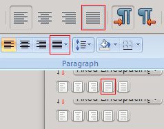
I agree with Louis that icons aren't clear enough. Actually, they might be
considered rather misleading for an untrained eye. Just take a look at the
attached example which shows the difference between Scribus's "Justified" icon
and commonly used icons for the same purpose:

? The first one is "Justified" icon in LibreOffice/OpenOffice.org
? The second one is "Justified" icon in MS Office 2007
? The third one is "Justified" icon in Scribus; so, it's only natural that
users who are accustomed to above-mentioned apps are going to use "Forced
Justified" instead of "Justified" (and I don't think tooltip change would do
much good to remedy this).

So, the fourth one is an example what can be done with Scribus's icon to make
sure nobody misses the right button; make "Forced justified" looks like an
"alien", since it usually is exactly that on page.

Regards,

M.
-------------- next part --------------
A non-text attachment was scrubbed...
Name: Justified-icons.jpg
Type: image/jpeg
Size: 11686 bytes
Desc: not available
URL:
<http://lists.scribus.net/pipermail/scribus/attachments/20111121/8587aa0a/attachment.jpg>