jiawulin001 commented on issue #16776:
URL: https://github.com/apache/echarts/issues/16776#issuecomment-1084146449
@dirslashls I am very sorry I made a mistake. You are right,
grid.axisPointer does not exist. The problem seems to be that radar chart does
not accept 'cross' as the type of a
This is an automated email from the ASF dual-hosted git repository.
susiwen8 pushed a commit to branch area-style-opacity
in repository https://gitbox.apache.org/repos/asf/echarts-doc.git
The following commit(s) were added to refs/heads/area-style-opacity by this
push:
new 94af90e fix(are
ycheeyan opened a new issue #16782:
URL: https://github.com/apache/echarts/issues/16782
### Version
5.3.1
### Link to Minimal Reproduction
https://jsfiddle.net/YeongCY/Lyta9bv3/13/
### Steps to Reproduce
1. Create a 2 bar series chart which named "value1" a
This is an automated email from the ASF dual-hosted git repository.
susiwen8 pushed a change to branch area-style-opacity
in repository https://gitbox.apache.org/repos/asf/echarts-doc.git.
at 90d2b3f fix(bar-race): realtimeSort was moved to series in
apache/echarts@d155de1
No new revisi
dirslashls opened a new issue #16781:
URL: https://github.com/apache/echarts/issues/16781
### What problem does this feature solve?
This was asked at #13778 and a file was pointed. However, I couldn't find it
available in the published API.
I like the 5.0 tooltip formatter and
dirslashls commented on issue #16776:
URL: https://github.com/apache/echarts/issues/16776#issuecomment-1084066746
Hi @jiawulin001 , grid.axisPointer is not a valid option as per the docs and
I also don't see it having the desired effect.
--
This is an automated message from the Apache Gi
ccxgl commented on issue #13768:
URL: https://github.com/apache/echarts/issues/13768#issuecomment-1084056747
现在解决了吗
--
This is an automated message from the Apache Git Service.
To respond to the message, please log on to GitHub and use the
URL above to go to the specific comment.
To unsu
reeshuai opened a new issue #16780:
URL: https://github.com/apache/echarts/issues/16780
### Version
5.3.1
### Link to Minimal Reproduction
_No response_
### Steps to Reproduce
1. we use vue2 and echarts5.3.1.
2. echarts options:
option: {
Enzeeun opened a new issue #16779:
URL: https://github.com/apache/echarts/issues/16779
### Version
5.3.1
### Link to Minimal Reproduction
_No response_
### Steps to Reproduce
I tried the example from
[echarts.apache.org](https://echarts.apache.org/examples
jiawulin001 edited a comment on issue #16776:
URL: https://github.com/apache/echarts/issues/16776#issuecomment-1084035244
Hi, as tested, if you move `grid.tooltip.axisPointer` out of tooltip and put
it at `grid.axisPointer`, no errors would occur. The reason why the error would
occur needs
jiawulin001 commented on issue #16776:
URL: https://github.com/apache/echarts/issues/16776#issuecomment-1084035244
Hi, as tested, if you move `grid.tooltip.axisPointer` out of tooltip and put
it at `grid.axisPointer`, no errors would occur. The reason why the error would
occur needs furthe
jiawulin001 commented on issue #16774:
URL: https://github.com/apache/echarts/issues/16774#issuecomment-1084027361
@FengTian2
你好,缝隙是可以去除的,只要将barCategoryGap设为0%即可,详细可见:https://echarts.apache.org/zh/option.html#series-bar.barCategoryGap
Hi, the gap between bars can be eliminated by setting
751974841 removed a comment on issue #16777:
URL: https://github.com/apache/echarts/issues/16777#issuecomment-1083940222
这是来自QQ邮箱的假期自动回复邮件。
您好,我最近正在休假中,无法亲自回复您的邮件。我将在假期结束后,尽快给您回复。
--
This is an automated message from the Apache Git Service.
To respond to the message, please log on
jiawulin001 edited a comment on issue #16774:
URL: https://github.com/apache/echarts/issues/16774#issuecomment-1083048271
你好,我理解柱状图的本质就是类别与数值的映射关系,如果把数值区间作为一个分类的话是可以实现你说的效果的,比如:
Hello, as I see, bar chart is a mapping from category to value. If we treat
each interval as a category, the i
1652185936 opened a new issue #16778:
URL: https://github.com/apache/echarts/issues/16778
### What problem does this feature solve?
多个x轴的数据可以进行比较 例如时间
2014 2015 2016 2017 2018 2019 2020
20132021202
echarts-bot[bot] commented on issue #16778:
URL: https://github.com/apache/echarts/issues/16778#issuecomment-1083952338
@1652185936 It seems you are not using English, I've helped translate the
content automatically. To make your issue understood by more people and get
helped, we'd like to
751974841 commented on issue #16777:
URL: https://github.com/apache/echarts/issues/16777#issuecomment-1083940222
这是来自QQ邮箱的假期自动回复邮件。
您好,我最近正在休假中,无法亲自回复您的邮件。我将在假期结束后,尽快给您回复。
--
This is an automated message from the Apache Git Service.
To respond to the message, please log on to GitH
751974841 opened a new issue #16777:
URL: https://github.com/apache/echarts/issues/16777
### Version
4.2.1
### Link to Minimal Reproduction
_No response_
### Steps to Reproduce
1. // 进行相关配置
this.chartOption = {
tooltip: {
//
echarts-bot[bot] commented on issue #16777:
URL: https://github.com/apache/echarts/issues/16777#issuecomment-1083939635
@751974841 It seems you are not using English, I've helped translate the
content automatically. To make your issue understood by more people and get
helped, we'd like to
jiawulin001 commented on a change in pull request #16772:
URL: https://github.com/apache/echarts/pull/16772#discussion_r839092715
##
File path: src/chart/line/LineView.ts
##
@@ -730,6 +730,10 @@ class LineView extends ChartView {
polygon = this._newPolygon(
jiawulin001 edited a comment on issue #16774:
URL: https://github.com/apache/echarts/issues/16774#issuecomment-1083048271
你好,我理解柱状图的本质就是类别与数值的映射关系,如果把数值区间作为一个分类的话是可以实现你说的效果的,比如:
Hello, as I see, bar chart is a mapping from category to value. If we treat
each interval as a category, the i
FengTian2 commented on issue #16774:
URL: https://github.com/apache/echarts/issues/16774#issuecomment-1083907854
> 你好,我理解柱状图的本质就是类别与数值的映射关系,如果把数值区间作为一个分类的话是可以实现你说的效果的,比如:
>
> 示例代码
> 这个问题可能更像是数据处理方面需要做的事。 如果我没理解对意思的话,请随时指正。
多谢回复 。
用你这方法貌似也可以,只是这样柱子与柱子之间有缝隙 ,效果不那么好 ,
我这个
dirslashls opened a new issue #16776:
URL: https://github.com/apache/echarts/issues/16776
### Version
5.3.1
### Link to Minimal Reproduction
_No response_
### Steps to Reproduce
1. Go to https://echarts.apache.org/examples/en/editor.html?c=radar
2. Add t
github-actions[bot] commented on issue #12277:
URL: https://github.com/apache/echarts/issues/12277#issuecomment-1083627577
This issue has been automatically closed because it did not have recent
activity. If this remains to be a problem with the latest version of Apache
ECharts, please ope
github-actions[bot] closed issue #12277:
URL: https://github.com/apache/echarts/issues/12277
--
This is an automated message from the Apache Git Service.
To respond to the message, please log on to GitHub and use the
URL above to go to the specific comment.
To unsubscribe, e-mail: commi
github-actions[bot] commented on issue #5631:
URL: https://github.com/apache/echarts/issues/5631#issuecomment-1083627498
This issue has been automatically marked as stale because it did not have
recent activity. It will be closed in 7 days if no further activity occurs. If
you wish not to
kriewall commented on pull request #16217:
URL: https://github.com/apache/echarts/pull/16217#issuecomment-1083447891
Hi @andrewchoi5 , @pissang I meant to follow up after CNY but lost track of
it. It looks like this merge request requires a review before it goes through.
Can someone from
dirslashls commented on issue #16705:
URL: https://github.com/apache/echarts/issues/16705#issuecomment-1083380513
Seems like #14848 is related (animation & resize).
--
This is an automated message from the Apache Git Service.
To respond to the message, please log on to GitHub and use the
sy commented on issue #16765:
URL: https://github.com/apache/echarts/issues/16765#issuecomment-1083104420
@jiawulin001 ok,thank you!
--
This is an automated message from the Apache Git Service.
To respond to the message, please log on to GitHub and use the
URL above to go to the speci
plainheart commented on a change in pull request #16772:
URL: https://github.com/apache/echarts/pull/16772#discussion_r838491187
##
File path: src/chart/line/LineView.ts
##
@@ -730,6 +730,10 @@ class LineView extends ChartView {
polygon = this._newPolygon(
plainheart commented on a change in pull request #16772:
URL: https://github.com/apache/echarts/pull/16772#discussion_r838491187
##
File path: src/chart/line/LineView.ts
##
@@ -730,6 +730,10 @@ class LineView extends ChartView {
polygon = this._newPolygon(
susiwen8 commented on a change in pull request #16767:
URL: https://github.com/apache/echarts/pull/16767#discussion_r838493222
##
File path: src/chart/sankey/SankeyView.ts
##
@@ -220,6 +222,15 @@ class SankeyView extends ChartView {
}
}
+
plainheart commented on a change in pull request #16772:
URL: https://github.com/apache/echarts/pull/16772#discussion_r838491187
##
File path: src/chart/line/LineView.ts
##
@@ -730,6 +730,10 @@ class LineView extends ChartView {
polygon = this._newPolygon(
jiawulin001 commented on a change in pull request #16772:
URL: https://github.com/apache/echarts/pull/16772#discussion_r838483895
##
File path: src/chart/line/LineView.ts
##
@@ -730,6 +730,10 @@ class LineView extends ChartView {
polygon = this._newPolygon(
jiawulin001 edited a comment on issue #16774:
URL: https://github.com/apache/echarts/issues/16774#issuecomment-1083048271
你好,我理解柱状图的本质就是类别与数值的映射关系,如果把数值区间作为一个分类的话是可以实现你说的效果的,比如:
示例代码
复制以下代码到https://echarts.apache.org/examples/zh/editor.html
```
option = {
xAxis: {
jiawulin001 commented on issue #16774:
URL: https://github.com/apache/echarts/issues/16774#issuecomment-1083048271
你好,我理解柱状图的本质就是类别与数值的映射关系,如果把数值区间作为一个分类的话是可以实现你说的效果的,比如:
示例代码
复制以下代码到https://echarts.apache.org/examples/zh/editor.html
```
option = {
xAxis: {
ty
plainheart commented on a change in pull request #16772:
URL: https://github.com/apache/echarts/pull/16772#discussion_r838452799
##
File path: src/chart/line/LineView.ts
##
@@ -730,6 +730,10 @@ class LineView extends ChartView {
polygon = this._newPolygon(
plainheart commented on a change in pull request #16772:
URL: https://github.com/apache/echarts/pull/16772#discussion_r838452799
##
File path: src/chart/line/LineView.ts
##
@@ -730,6 +730,10 @@ class LineView extends ChartView {
polygon = this._newPolygon(
MaXal opened a new issue #16775:
URL: https://github.com/apache/echarts/issues/16775
### Version
5.3.1
### Link to Minimal Reproduction
_No response_
### Steps to Reproduce
```
const yearCount = 7;
const categoryCount = 30;
const xAxisData: str
FengTian2 opened a new issue #16774:
URL: https://github.com/apache/echarts/issues/16774
### What problem does this feature solve?
比如要展示各个区间数量 ,
X轴表示区间 ,Y轴是区间的数量
比如X轴坐标, 1-10 范围 ,数量有100个
11-20 范围 ,数量有200 个
21-30 范围 ,数量有 0个 ,
31-40范围 , 数量有
echarts-bot[bot] commented on issue #16774:
URL: https://github.com/apache/echarts/issues/16774#issuecomment-1082840118
@FengTian2 It seems you are not using English, I've helped translate the
content automatically. To make your issue understood by more people and get
helped, we'd like to
emyly removed a comment on issue #16773:
URL: https://github.com/apache/echarts/issues/16773#issuecomment-1082767813
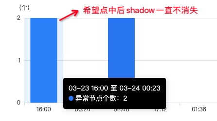
> After clicking on the echarts histogram, the shadow of the column in the
point does not disappear until the next column in the point disappears again.
How do I do this?
emyly commented on issue #16773:
URL: https://github.com/apache/echarts/issues/16773#issuecomment-1082767813
> After clicking on the echarts histogram, the shadow of the column in the
point does not disappear until the next column in the point disappears again.
How do I do this?
@[e
emyly commented on issue #16773:
URL: https://github.com/apache/echarts/issues/16773#issuecomment-1082767224
After clicking on the echarts histogram, the shadow of the column in the
point does not disappear until the next column in the point disappears again.
How do I do this?
--
This i
emyly removed a comment on issue #16773:
URL: https://github.com/apache/echarts/issues/16773#issuecomment-1082766790
> @emyly It seems you are not using English, I've helped translate the
content automatically. To make your issue understood by more people and get
helped, we'd like to sugge
susiwen8 closed issue #16729:
URL: https://github.com/apache/echarts/issues/16729
--
This is an automated message from the Apache Git Service.
To respond to the message, please log on to GitHub and use the
URL above to go to the specific comment.
To unsubscribe, e-mail: commits-unsubscr
emyly commented on issue #16773:
URL: https://github.com/apache/echarts/issues/16773#issuecomment-1082766790
> @emyly It seems you are not using English, I've helped translate the
content automatically. To make your issue understood by more people and get
helped, we'd like to suggest using
echarts-bot[bot] commented on issue #16773:
URL: https://github.com/apache/echarts/issues/16773#issuecomment-1082764268
@emyly It seems you are not using English, I've helped translate the content
automatically. To make your issue understood by more people and get helped,
we'd like to sugg
emyly opened a new issue #16773:
URL: https://github.com/apache/echarts/issues/16773
### What problem does this feature solve?
### What does the proposed API loo
This is an automated email from the ASF dual-hosted git repository.
github-bot pushed a change to branch gh-pages
in repository https://gitbox.apache.org/repos/asf/echarts-handbook.git.
discard 408bf56 Deploying to gh-pages from @
apache/echarts-handbook@a4d65365170a6b2b8c1de6b12af8d9597048ff
This is an automated email from the ASF dual-hosted git repository.
ovilia pushed a commit to branch master
in repository https://gitbox.apache.org/repos/asf/echarts-handbook.git
The following commit(s) were added to refs/heads/master by this push:
new 11d408c fix(bar-race): realtimeSort w
This is an automated email from the ASF dual-hosted git repository.
ovilia pushed a commit to branch master
in repository https://gitbox.apache.org/repos/asf/echarts-doc.git
The following commit(s) were added to refs/heads/master by this push:
new 90d2b3f fix(bar-race): realtimeSort was mo
52 matches
Mail list logo