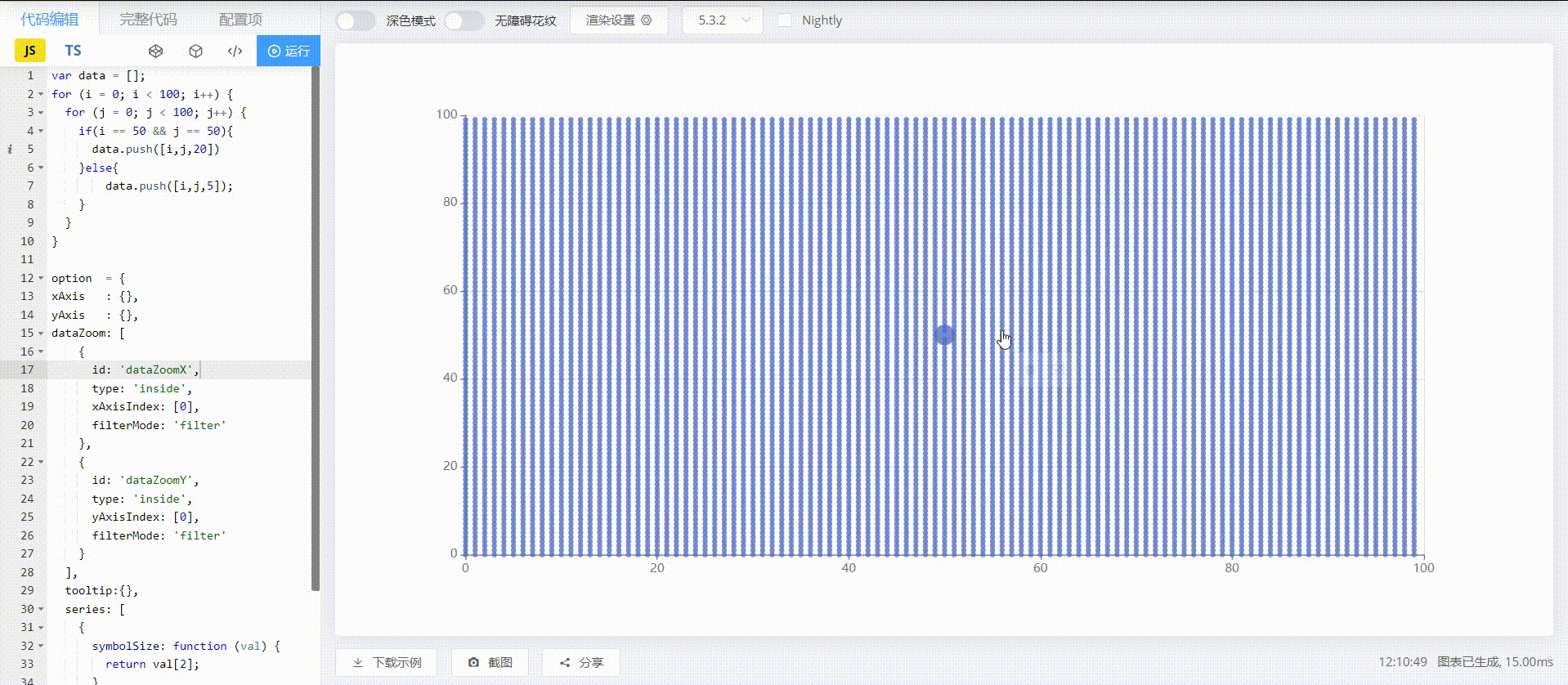
shiboqingning commented on issue #17028:
URL: https://github.com/apache/echarts/issues/17028#issuecomment-1127207542
The renderings are as follows:
See The
This is an automated email from the ASF dual-hosted git repository.
wangzx pushed a change to branch master
in repository https://gitbox.apache.org/repos/asf/echarts.git
from 84b957855 Merge pull request #17009 from susiwen8/tree-relative
add ffc742918 fix(graphic): 1) fix some options
This is an automated email from the ASF dual-hosted git repository.
wangzx pushed a commit to branch master
in repository https://gitbox.apache.org/repos/asf/echarts.git
commit 5cf53e24ac751650ce8d76dde957f1b0d0bd50e6
Merge: 84b957855 ffc742918
Author: Zhongxiang Wang
AuthorDate: Mon May 16
echarts-bot[bot] commented on PR #17007:
URL: https://github.com/apache/echarts/pull/17007#issuecomment-1127181996
Congratulations! Your PR has been merged. Thanks for your contribution!
--
This is an automated message from the Apache Git Service.
To respond to the message, please log
plainheart merged PR #17007:
URL: https://github.com/apache/echarts/pull/17007
--
This is an automated message from the Apache Git Service.
To respond to the message, please log on to GitHub and use the
URL above to go to the specific comment.
To unsubscribe, e-mail:
deshanruhunage commented on issue #17036:
URL: https://github.com/apache/echarts/issues/17036#issuecomment-1127179941

--
This is an automated message from the Apache Git
echarts-bot[bot] commented on issue #17037:
URL: https://github.com/apache/echarts/issues/17037#issuecomment-1127173646
@1076momo It seems you are not using English, I've helped translate the
content automatically. To make your issue understood by more people and get
helped, we'd like to
1076momo opened a new issue, #17037:
URL: https://github.com/apache/echarts/issues/17037
### Version
5.3.2
### Link to Minimal Reproduction
_No response_
### Steps to Reproduce
setTimeout(function () {
option = {
legend: {},
tooltip: {
deshanruhunage opened a new issue, #17036:
URL: https://github.com/apache/echarts/issues/17036
### What problem does this feature solve?
I want to make the legend area in a two-column in Apache Echarts, how I can
achieve this with legend options?
### What does the
maneetgoyal commented on PR #16243:
URL: https://github.com/apache/echarts/pull/16243#issuecomment-1127163635
@Dingzhaocheng i am using the latest version. The "dataType" property is
working but I want to highlight both nodes and edges at the same time.
Currently it is allowing me to
teuf22 closed issue #17023: [Bug] Too many splitlines on time axis
URL: https://github.com/apache/echarts/issues/17023
--
This is an automated message from the Apache Git Service.
To respond to the message, please log on to GitHub and use the
URL above to go to the specific comment.
To
teuf22 commented on issue #17023:
URL: https://github.com/apache/echarts/issues/17023#issuecomment-1127161490
Thank you for the tips. Great library
--
This is an automated message from the Apache Git Service.
To respond to the message, please log on to GitHub and use the
URL above to go
ziyingjing commented on issue #17034:
URL: https://github.com/apache/echarts/issues/17034#issuecomment-1127160396
>
可能我没描述清楚,我的诉求是我能坐标轴的刻度可以写死成固定的值,但是设置data能按着坐标轴的实际所属区间显示
如下面这张图
![107101652669450_
Ovilia commented on issue #17021:
URL: https://github.com/apache/echarts/issues/17021#issuecomment-1127157282
`markArea` is a simpler way to make it. Otherwise, you can use
`chart.getOptions().grid.height` to get the size of the grid area.
--
This is an automated message from the Apache
Ovilia commented on issue #17023:
URL: https://github.com/apache/echarts/issues/17023#issuecomment-1127156199
You can also set `xAxis.minInterval`.
--
This is an automated message from the Apache Git Service.
To respond to the message, please log on to GitHub and use the
URL above to go
Ovilia commented on issue #17025:
URL: https://github.com/apache/echarts/issues/17025#issuecomment-1127155815
目前无法做到这一点,可以通过一个额外的 series,该 series 只包含希望增加 areaStyle 的数据
--
This is an automated message from the Apache Git Service.
To respond to the message, please log on to GitHub and use
echarts-bot[bot] commented on issue #17028:
URL: https://github.com/apache/echarts/issues/17028#issuecomment-1127154679
@shiboqingning Please provide a demo for the issue either with [Official
Editor](https://echarts.apache.org/examples/editor.html),
Ovilia commented on issue #17028:
URL: https://github.com/apache/echarts/issues/17028#issuecomment-1127154630
This doesn't look like a bug to me. Please create a demo if you think so.
--
This is an automated message from the Apache Git Service.
To respond to the message, please log on to
Ovilia commented on issue #17031:
URL: https://github.com/apache/echarts/issues/17031#issuecomment-1127153991
I don't think this is a bug. When all data is re-rendered, the old data is
cleared and rendered again.
--
This is an automated message from the Apache Git Service.
To respond to
Ovilia commented on issue #17033:
URL: https://github.com/apache/echarts/issues/17033#issuecomment-1127152973
Set `label.overflow` to be `'break'`.
--
This is an automated message from the Apache Git Service.
To respond to the message, please log on to GitHub and use the
URL above to go
Ovilia commented on issue #17034:
URL: https://github.com/apache/echarts/issues/17034#issuecomment-1127151499
可以的,相当于 `['Excellent', 'Good', 'OK', 'Bad']` 例子,写成字符串形式即可
--
This is an automated message from the Apache Git Service.
To respond to the message, please log on to GitHub and use
Ovilia commented on issue #17035:
URL: https://github.com/apache/echarts/issues/17035#issuecomment-1127150933
The class name of the tooltip can be set with
[tooltip.className](https://echarts.apache.org/en/option.html#tooltip.className).
--
This is an automated message from the Apache
jiawulin001 commented on issue #17021:
URL: https://github.com/apache/echarts/issues/17021#issuecomment-1127125927
You can use `markArea` to achieve such effect, by setting the gray zone data
to none and put markArea there. But this method is only applicable to static
chart. Please check
dforel closed issue #17027: [Bug] When painting a pillar with a bar, use
dataset mode, and when you use encode, it will cause the legend to
disappear;当用bar画柱子时候,用dataset模式,当用encode的时候,就会导致legend不见了
URL: https://github.com/apache/echarts/issues/17027
--
This is an automated message from the
jiawulin001 commented on issue #17027:
URL: https://github.com/apache/echarts/issues/17027#issuecomment-1127118439
You can refer to
[this](https://echarts.apache.org/zh/option.html#series-bar.name) for `name`
setting. For what I mean you can see the attached code for referenece.
Dingzhaocheng commented on PR #16243:
URL: https://github.com/apache/echarts/pull/16243#issuecomment-1127053697
> > @Dingzhaocheng hi, how can we highlight both nodes and edges
simultaneously?
>
> You can see the PR changes file, you can follow these changes to directly
modify your
Dingzhaocheng commented on PR #16243:
URL: https://github.com/apache/echarts/pull/16243#issuecomment-1127050223
> @Dingzhaocheng hi, how can we highlight both nodes and edges
simultaneously?
You can see the PR changes file, you can follow these changes to directly
modify your local
Dingzhaocheng commented on PR #16243:
URL: https://github.com/apache/echarts/pull/16243#issuecomment-1127050040
> @pissang please help
You can see the PR changes file, you can follow these changes to directly
modify your local package, then you can use the new API on the proposal,
github-actions[bot] commented on issue #12636:
URL: https://github.com/apache/echarts/issues/12636#issuecomment-1127031142
This issue has been automatically marked as stale because it did not have
recent activity. It will be closed in 7 days if no further activity occurs. If
you wish not
github-actions[bot] commented on issue #12629:
URL: https://github.com/apache/echarts/issues/12629#issuecomment-1127031139
This issue has been automatically marked as stale because it did not have
recent activity. It will be closed in 7 days if no further activity occurs. If
you wish not
CodingFrizey opened a new issue, #17035:
URL: https://github.com/apache/echarts/issues/17035
### Version
5.3.2
### Link to Minimal Reproduction
_No response_
### Steps to Reproduce
1. Create a chart inside a bootstrap application
2. Add the tooltip
dforel commented on issue #17027:
URL: https://github.com/apache/echarts/issues/17027#issuecomment-1126967044
> So the problem here is not that "2017 legend disappears" but "**Another
2015 series is added and squeeze out the 2017 series**". If you watch carefully
you can see that the first
sammuell commented on issue #17021:
URL: https://github.com/apache/echarts/issues/17021#issuecomment-1126939431
> Also, do you mean that you want all gray bars to be at 250 in this
picture?
Exactly. I first tried to draw the grey rectangles using the graphic option.
That does not work
echarts-bot[bot] commented on issue #17034:
URL: https://github.com/apache/echarts/issues/17034#issuecomment-1126932463
@ziyingjing It seems you are not using English, I've helped translate the
content automatically. To make your issue understood by more people and get
helped, we'd like to
ziyingjing opened a new issue, #17034:
URL: https://github.com/apache/echarts/issues/17034
### Version
5.2.2
### Link to Minimal Reproduction
_No response_
### Steps to Reproduce
https://echarts.apache.org/examples/zh/editor.html?c=parallel-simple
35 matches
Mail list logo