Ben--

worked perfectly.  Thank you.  My first real experience with lattice
graphics.
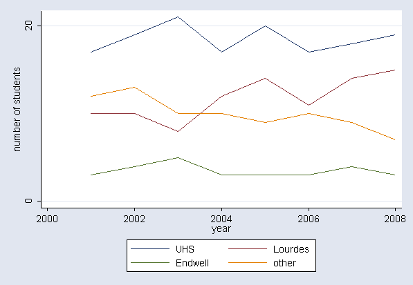
--Chris

Christopher W. Ryan, MD
SUNY Upstate Medical University Clinical Campus at Binghamton
40 Arch Street, Johnson City, NY  13790
cryanatbinghamtondotedu
PGP public keys available at http://home.stny.rr.com/ryancw/

"If you want to build a ship, don't drum up the men to gather wood,
divide the work and give orders. Instead, teach them to yearn for the
vast and endless sea."  [Antoine de St. Exupery]

Ben Bolker wrote:
> Christopher W. Ryan <cryan <at> binghamton.edu> writes:
>
>> I can't seem to find just what I'm looking for in R help, Everitt and
>> Hothorn HSAUR, Murrell's book, or the R graphics gallery at
>> http://addictedtor.free.fr/graphiques/.  Probably not looking
>> efficiently, but anyway,
>>
>> If my data look like this:
>>
>>> head(data)
>>       cat startyear studentid
>> 1   other      2001        12
>> 2     UHS      2001        17
>> 3 Lourdes      2001        10
>> 4 Endwell      2001         3
>> 5   other      2002        13
>> 6     UHS      2002        19
>> What is the easiest way to make a line graph like this (made this one in
>> Stata):
>>
>> http://bingweb.binghamton.edu/~cryan/Workload.png
>>
>> Thank you.
>
>   assuming "studentid" is your students,
>
> library(lattice)
> xyplot(studentid~startyear,groups=cat,auto.key=TRUE,type="l",data=data)
>
>   (I think -- haven't tested at all)
>   that, or reshape the data to wide format and use matplot.
>
>   Ben Bolker
>
> ______________________________________________
> R-help@r-project.org mailing list
> https://stat.ethz.ch/mailman/listinfo/r-help
> PLEASE do read the posting guide http://www.R-project.org/posting-guide.html
> and provide commented, minimal, self-contained, reproducible code.
>

______________________________________________
R-help@r-project.org mailing list
https://stat.ethz.ch/mailman/listinfo/r-help
PLEASE do read the posting guide http://www.R-project.org/posting-guide.html
and provide commented, minimal, self-contained, reproducible code.