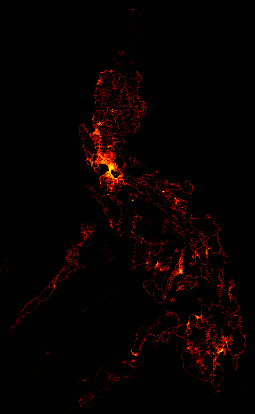
Hi guys,

So I've been doing these node density maps for almost 2 years now. I
thought it would be cool to see the change in the node density as an
animation:
http://wiki.openstreetmap.org/w/images/8/86/Philippines_node_density_increase_animation.gif
This is not a true animation through time though. I just faded-in each
quarter's map one after the other. But I think it still impressively shows
the amount of work that OSM contributors have put it in.

Great work guys! Keep it up! :)

Eugene
_______________________________________________
talk-ph mailing list
[email protected]
https://lists.openstreetmap.org/listinfo/talk-ph