I think we are getting somewhere!
Not much of a fan of the "handwritten" visual here, I don't really like the
tick but I think can live with it :) Recreated it um full vector fashion to
keep the SVG as true to itself as possible, also made an alternate version
to see if anyone prefers a cleaner look.
Would love to hear Jeremy and everyone else opinion before we can call
anything final.
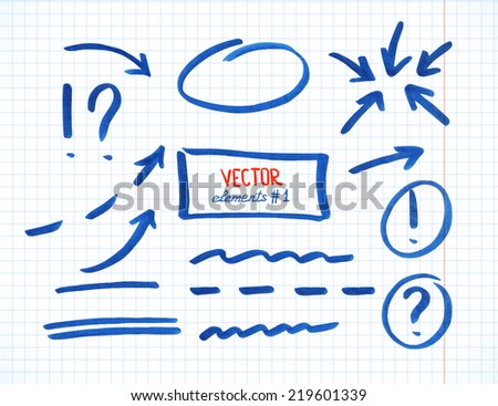
<http://www.duarteramos.pt/media/share/TiddlyWiki_TiddlerPoster08.png>


<http://www.duarteramos.pt/media/share/TiddlyWiki_TiddlerPoster07.png>


On Thursday, 8 January 2015 14:17:33 UTC, Mat wrote:
>
> Beginning to think maybe correspondence woudl be smoother via email, but
> after each draft I find myself going "ok, just a few tiny things and then
> we should be done!" - which has been going on now for quite a few drafts ;-)
>
> Anyway, here are just a few tiny things and then we should be done:
>
> I took the liberty of doing some editing myself, among other things to
> make it even more balanced. This included move the fish vertically a bit
> and making tw.com a bit more subtle (nobody can miss it though). I think
> it looks good, what do you say? I suggest putting my version as a
> transparent layer on top of yours to see all the detail changes.
>
>
> <https://lh6.googleusercontent.com/--_BEuTiYnlQ/VK6NGrLpYmI/AAAAAAAAPHg/N3gasKR5xUU/s1600/DuartesPoster_MatVersion1.png>
>
> I'm really happy we got some input from my teacher. It really improves it.
> The bit about putting the headline alone on top is great and, funnily, by
> putting the url under the fish it almost like when you have an image with a
> descriptive text under it, i.e "here you see a tiddlywiki fish" sort of.
>
> Now... what I would *really* prefer is actually this one crucial bit to
> make sure they can't miss what might very well be the tipping point to make
> them actually try it out. See pic below. The line is * intended* to look
> as if a friend of theirs just wanted to make sure they didn't miss it and
> so simply picked up a pen:
>
>
> <https://lh6.googleusercontent.com/-qr9UBCh0ELM/VK6N9ijhJsI/AAAAAAAAPHo/M0-ssKCFhNM/s1600/DuartesPoster_MatVersion2.png>
> The line is from this
> <http://thumb7.shutterstock.com/display_pic_with_logo/954646/219601339/stock-vector-set-of-correction-and-highlight-elements-part-circles-arrows-lines-etc-hand-drawn-with-219601339.jpg>
>
> image (cut out and manipulated). I found it by searching on google images
> for "hand drawn line" and selecting color blue. BTW, the above versions are
> a mix of cut+move, type on top of stuff, etc so they are not real quality
> with vectors etc.
>
> I can only speak for myself, but I would be happy if it looks like this
> last variant.
>
>
> <:-)
>
>
>
>

--
You received this message because you are subscribed to the Google Groups
"TiddlyWiki" group.
To unsubscribe from this group and stop receiving emails from it, send an email
to [email protected].
To post to this group, send email to [email protected].
Visit this group at http://groups.google.com/group/tiddlywiki.
For more options, visit https://groups.google.com/d/optout.