Public bug reported:

Ubuntu 14.10 r179
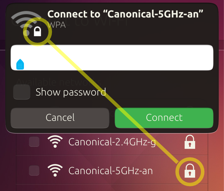
1. From System Settings, or the first-run setup, choose a closed Wi-Fi network.
2. Observe the padlock icons in the network list vs. the authentication dialog.

What you see:
* The standalone icon has a thin shackle, while the network emblem has a thick
shackle.
* In the standalone icon, the shackle is inset from the edge, while in the
network emblem it's flush with the edge.
* The standalone icon has a keyhole, while the network emblem does not.

What you should see: The icons are exactly the same.

** Affects: ubuntu-themes (Ubuntu)
     Importance: Undecided
         Status: New

** Attachment added: "screenshot of the problem"

https://bugs.launchpad.net/bugs/1359204/+attachment/4182486/+files/Inconsistent%20padlock%20icons.png

--
You received this bug notification because you are a member of Ubuntu
Touch seeded packages, which is subscribed to ubuntu-themes in Ubuntu.
https://bugs.launchpad.net/bugs/1359204

Title:
  Padlock shape is inconsistent in standlone icon vs. Wi-Fi emblem

Status in “ubuntu-themes” package in Ubuntu:
  New

Bug description:
  Ubuntu 14.10 r179

  1. From System Settings, or the first-run setup, choose a closed Wi-Fi
network.
  2. Observe the padlock icons in the network list vs. the authentication
dialog.

  What you see:
  * The standalone icon has a thin shackle, while the network emblem has a
thick shackle.
  * In the standalone icon, the shackle is inset from the edge, while in the
network emblem it's flush with the edge.
  * The standalone icon has a keyhole, while the network emblem does not.

  What you should see: The icons are exactly the same.

To manage notifications about this bug go to:
https://bugs.launchpad.net/ubuntu/+source/ubuntu-themes/+bug/1359204/+subscriptions

--
Mailing list: https://launchpad.net/~touch-packages
Post to     : touch-packages@lists.launchpad.net
Unsubscribe : https://launchpad.net/~touch-packages
More help   : https://help.launchpad.net/ListHelp