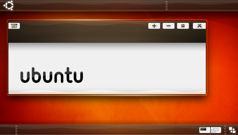
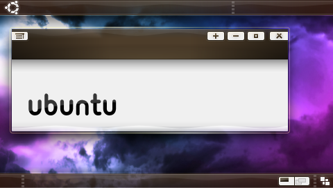
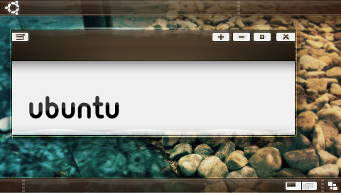
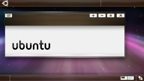
those buttons are good additions -> they are explicit about their functions.
slim.smooth.good

2008/7/28 Nicholas Kraak <[EMAIL PROTECTED]>:
>> New batch, I tried to get everyones ideas in here. The only thing I did
>> differently from the suggestions was the buttons, the gray background to
>> them just made it all feel more "solid".
>>
>> http://i4.photobucket.com/albums/y111/raraken/kin_piano_kith_r2.png
>> http://i4.photobucket.com/albums/y111/raraken/kin_piano_clouds_r2.png
>> http://i4.photobucket.com/albums/y111/raraken/kin_piano_rocks_r2.png
>>
>> http://i4.photobucket.com/albums/y111/raraken/kin_piano_trnthtfrnupsddwn_r2.png
>
> Sorry Ken, it looks brilliant but I'm not too fond of those buttons. Perhaps
> something similar to New Wave (but obviously with a brown button background
> and maybe even a dark brown button outline).
>
> In my personal opinion, the buttons should be easily visible, but not so
> visible they constantly draw the users eye to them. But obviously that's
> just my two cents. Other then that keep up the fine work,
>
> Nicholas
>
> PS: If you want me to draw a mock-up of what I mean, just ask.
>
> --
> ubuntu-art mailing list
> [email protected]
> https://lists.ubuntu.com/mailman/listinfo/ubuntu-art
>
>


--
Nemes Ioan Sorin

--
ubuntu-art mailing list
[email protected]
https://lists.ubuntu.com/mailman/listinfo/ubuntu-art