Il giorno lun, 28/07/2008 alle 15.23 +0200, Duncan Austin ha scritto:
>
>
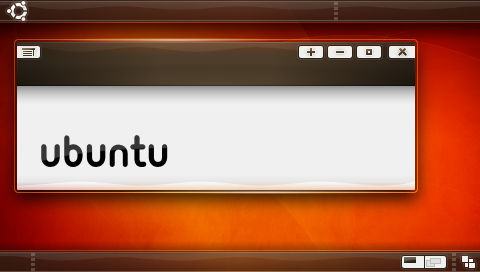
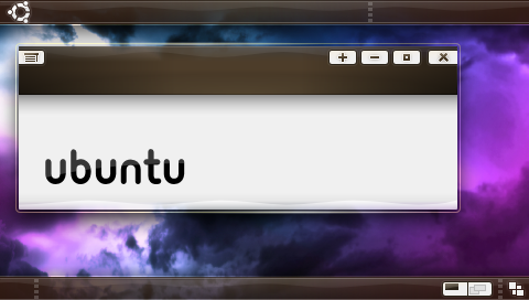
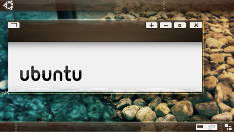
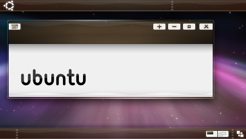
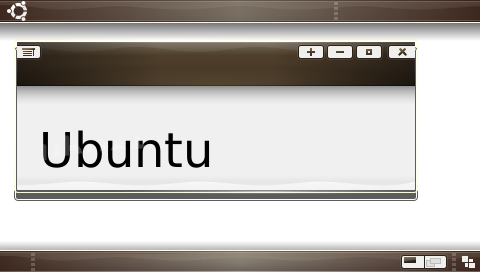
>                 New batch, I tried to get everyones ideas in here. The
>                 only thing I did differently from the suggestions was
>                 the buttons, the gray background to them just made it
>                 all feel more "solid".
>
>
> http://i4.photobucket.com/albums/y111/raraken/kin_piano_kith_r2.png
>
> http://i4.photobucket.com/albums/y111/raraken/kin_piano_clouds_r2.png
>
> http://i4.photobucket.com/albums/y111/raraken/kin_piano_rocks_r2.png
>
> http://i4.photobucket.com/albums/y111/raraken/kin_piano_trnthtfrnupsddwn_r2.png
>
>                 aaand... The development SVG. One thing about the SVG
>                 is that it's -very- rough.
>
>
> https://wiki.ubuntu.com/Artwork/Incoming/Intrepid/Kin_Intrepid?action=AttachFile&do=get&target=kin_piano_rev2.svg
>
>
>
>
> How about something different for the buttons, since we're being
> distinctive?
>
> Mockup here:
>
> http://www.readitsideways.com/kin_piano_grass_buttons.png
>
> Duncan
>
Quite difficult to make them work, but i think it can be done. In
Emerald it's easier than in metacity, so maybe someone can try making a
working candidate for them.. I think they're cool and original, but
thinking about usability i have some doubts...

Mario
--
ubuntu-art mailing list
[email protected]
https://lists.ubuntu.com/mailman/listinfo/ubuntu-art