Am 06.08.2008, 20:26 Uhr, schrieb Thorsten Wilms <[EMAIL PROTECTED]>:
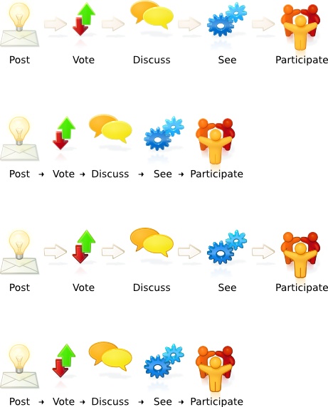
> Here we go again:
> http://thorwil.files.wordpress.com/2008/08/process_06_set.jpg
>
> Tweaked the envelope and cogs. Added labels, tried a space saving
> layout.
>
> Alexi Helligar: your comment about a lack of presence made me reconsider
> my aiming firmly at a smooth and less comic-like look. So I added
> versions with stronger outlines, as a border shadow is no option because
> of perspective.
>
>


I'm in awe of your 3D-Ubunutu-Logo version! This is genious! Overall, with
that white background, I like the ones with the stronger outline more, it
makes a better contrast, the others look a little bit blurred (on white
background!).

Marc

--
ubuntu-art mailing list
[email protected]
https://lists.ubuntu.com/mailman/listinfo/ubuntu-art