On Tue, 2008-09-30 at 00:42 +0100, Danny King wrote:

> http://farm4.static.flickr.com/3127/2900480718_9c2f07dbb8_o_d.png
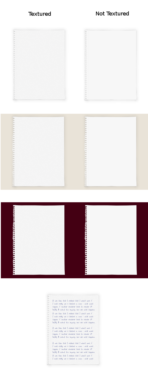
The torn perforation does quite a lot to give it the impression of a
piece of paper. This might go lost on 48 px already, though.

The other edges look to regular in comparison.

The ripped out of a notebook association is very fitting for some stuff
and not at all for others. It wouldn't be right to see a text file you
worked on for several days like that, I feel.

The texture pretty much disappears with slightly low display contrast,
which I guess means it's not worth it :/

Still, a good thing to experiment with ideas like these.


--
Thorsten Wilms

thorwil's design for free software:
http://thorwil.wordpress.com/


--
ubuntu-art mailing list
[email protected]
https://lists.ubuntu.com/mailman/listinfo/ubuntu-art