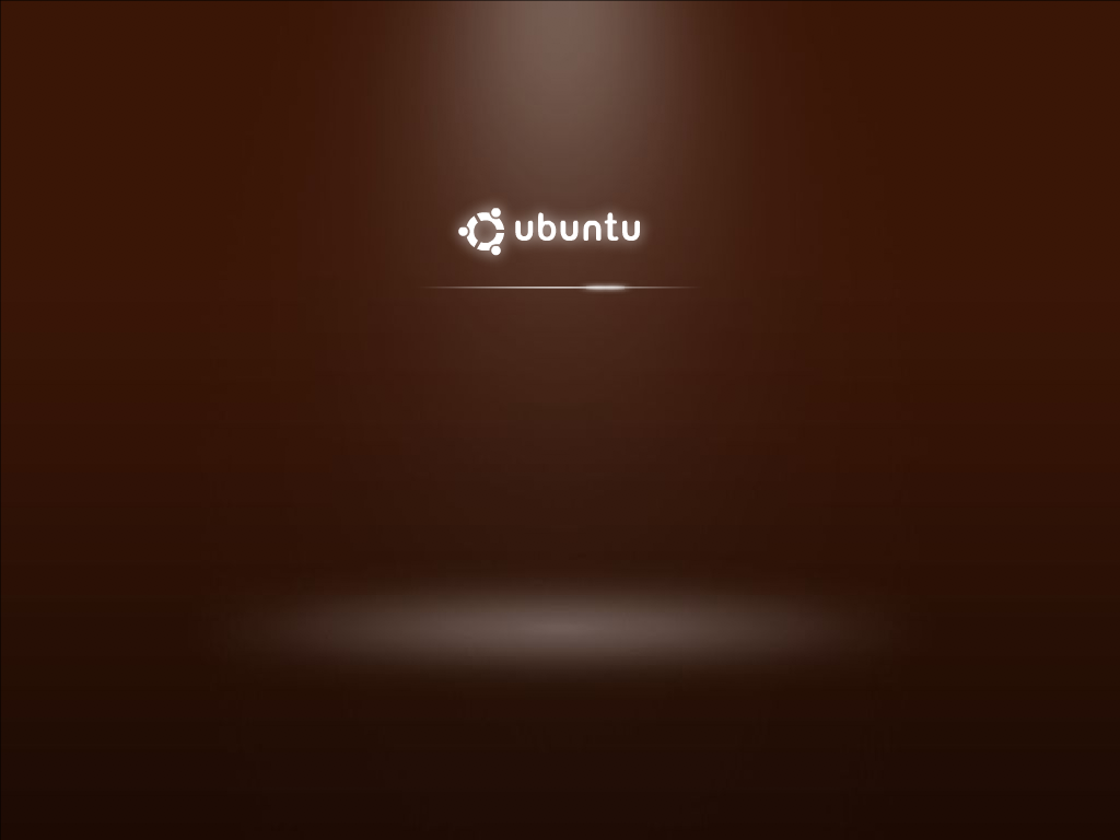
O.O You guys listened?!? Oh man, Ubuntu's community is > *

^-^ I honestly think it is much much better! For some reason -
https://wiki.ubuntu.com/Artwork/Incoming/Karmic/Boot/Demo?action=AttachFile&do=get&target=xsplash-2.png
is looking a little rough on the gradients (checked it on 4 different
monitors).
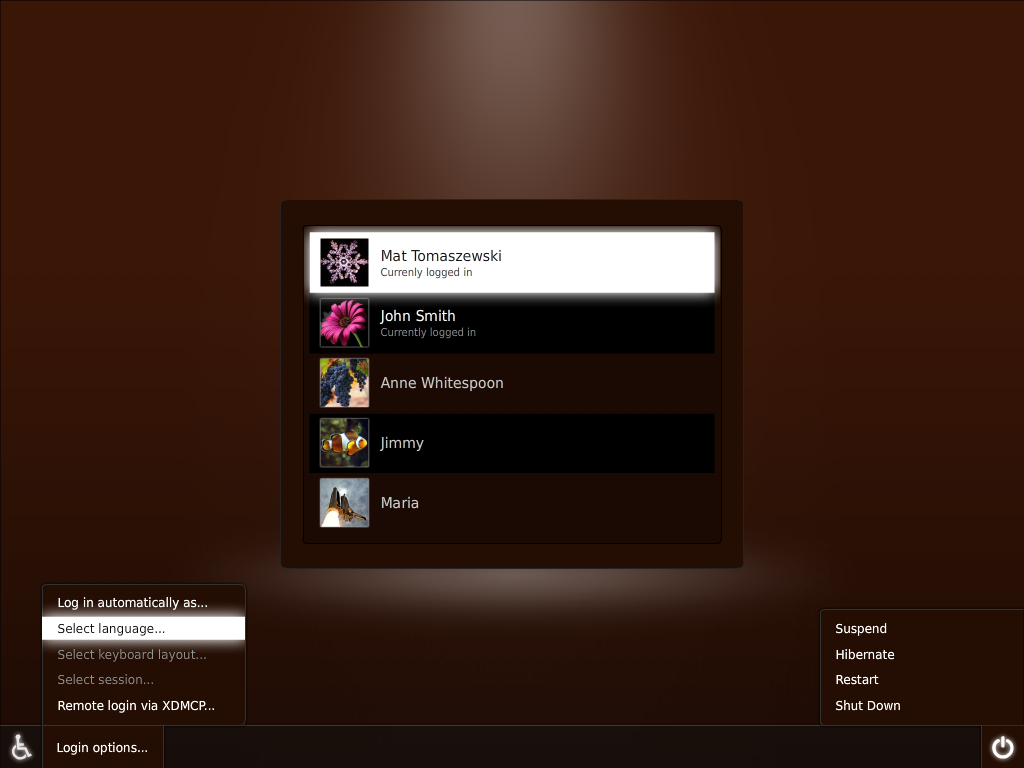
Now, what I don't like:
---------------------------------------
-The color of the bottom toolbar contrasts with the color the the
background tool much. They just look like mismatched browns :(

- The very contrasted white selections in
https://wiki.ubuntu.com/Artwork/Incoming/Karmic/Boot/Demo?action=AttachFile&do=get&target=gdm-menus-2.png
(Select Language and Mat) I like the fact that you guys are using a
solid color, I'm sure that really cuts down on the amount of images
needed! But something about the white looks off to me. Umm, I don't
believe light brown would look much better but mabye a light brown (or
light gray) really close to white, with a some kind of thick border of
darker brown (or darker gray) that is still pretty light :)


Oh, I just noticed the throbber! It looks much, much better!! Even tho
I dislike some things I think it has gotten much better since the last
one, and perhaps Iteration 3 will nail it :D

Anyways, just my $0.1
~Dave

--
ubuntu-art mailing list
[email protected]
https://lists.ubuntu.com/mailman/listinfo/ubuntu-art