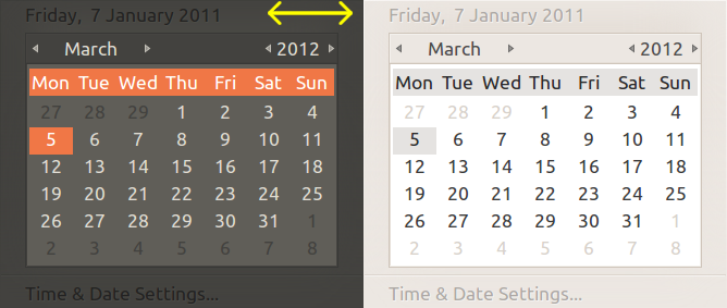
Oops, that got posted instead of the attachment, I of course /can/
reproduce it on natty under both Luminance and Radiance as shown (see
attachment).
The problem is an extremely low-contrast between text that needs to be
read, and the background colour.  It appears that it might be being
rendered using the "disabled menu item" colour choices, but that
probably isn't suitable for text that actually needs to be understood by
the user.

I presume that the bottom of the two pieces of text "Time & Date
Settings..." (and the specifc one that James originally spotted) is
intended to be a menu-item link again long-term of this should be
considered when doing any mockups to try and solve this.

Perhaps the solution would be to make the top date a clickable menu-item
that resets the calendar to the current date (currently the calendar
doesn't provide any indication the user whether the highlighted date is
the current one, which can be misleading if forgotten).

** Attachment added: "indicator-datetime-foreground-on-foreground.png"

https://bugs.launchpad.net/ubuntu/+source/indicator-datetime/+bug/649882/+attachment/1786576/+files/indicator-datetime-foreground-on-foreground.png

--
You received this bug notification because you are a member of Ubuntu
Bugs, which is subscribed to Ubuntu.
https://bugs.launchpad.net/bugs/649882

Title:
  Calendar date is unreadable when using Ambience theme

--
ubuntu-bugs mailing list
[email protected]
https://lists.ubuntu.com/mailman/listinfo/ubuntu-bugs