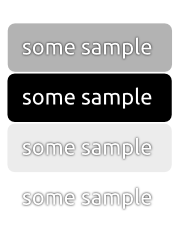
Why could we not use the same technique, currently utilized in notify-
osd? It is using a centered drop-shadow so no matter how bright or dark
the background is, there's always enough contrast to make the text
readable. It's not too hard to add. See the attached sample.
** Attachment added: "suggestion for visually more robust text-rendering"

https://bugs.launchpad.net/ubuntu/+source/unity/+bug/824916/+attachment/2335837/+files/text-rendering-suggestion.png

--
You received this bug notification because you are a member of Ubuntu
Bugs, which is subscribed to Ubuntu.
https://bugs.launchpad.net/bugs/824916

Title:
  Dash text is unreadable with some background pictures

To manage notifications about this bug go to:
https://bugs.launchpad.net/ayatana-design/+bug/824916/+subscriptions

--
ubuntu-bugs mailing list
[email protected]
https://lists.ubuntu.com/mailman/listinfo/ubuntu-bugs