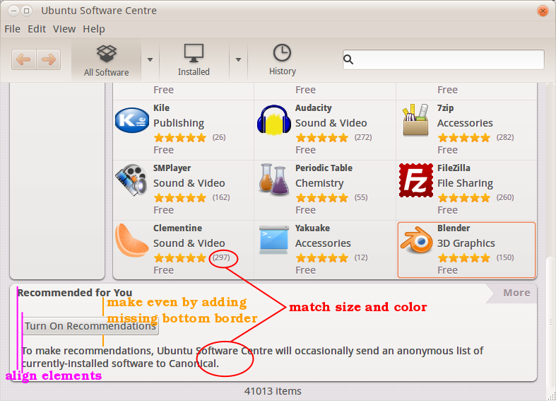
Yes, that is much better, thanks Kiwinote. I see three things still to fix:
* the heading should have a bottom border, like it does in the tiled sections
* the button and caption should align horizontally with the heading
* the caption should be small and grey, like the category counts or the "X of Y
people found this review helpful".
** Attachment added: "Annotated screenshot"

https://bugs.launchpad.net/ubuntu/+source/software-center/+bug/942109/+attachment/2790434/+files/usc.png

--
You received this bug notification because you are a member of Ubuntu
Bugs, which is subscribed to Ubuntu.
https://bugs.launchpad.net/bugs/942109

Title:
  "Recommendations" section text and padding is far too large

To manage notifications about this bug go to:
https://bugs.launchpad.net/ubuntu/+source/software-center/+bug/942109/+subscriptions

--
ubuntu-bugs mailing list
[email protected]
https://lists.ubuntu.com/mailman/listinfo/ubuntu-bugs