I agree the switcher is not clear enough to navigate visually. It often
takes me a moment or two longer than it should to figure out which app
is highlighted.
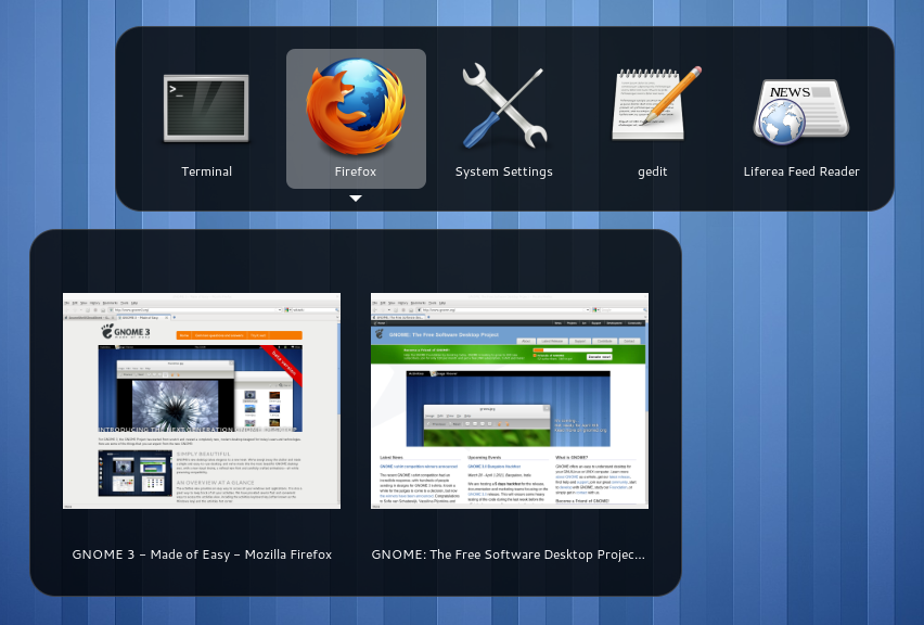
It's one thing to have coloured app backgrounds on the launcher but when
it comes to the alt-tab switcher I think these colours compared to the
relative lack of visual contrast of the hilighted item make for poor
usability. And usability should come before visual appeal.

The Gnome-shell switcher is much cleaner, simpler, and more obvious which item
is hilighted, eg:
http://live.gnome.org/GnomeShell/CheatSheet?action=AttachFile&do=get&target=shortcuts-Alt-Tab.png

If you compare the differences here, you see all the extraneous
information the Unity switcher is presenting the user who just wants to
quickly switch app: coloured backgrounds on each app, 3d effect boarders
on each app, a boarder around the whole switcher, and boarder lines on
either side of the boarder around the switcher...  Talk about over-
complicated.

--
You received this bug notification because you are a member of Ubuntu
Bugs, which is subscribed to Ubuntu.
https://bugs.launchpad.net/bugs/857627

Title:
  Unity Switcher highlight does not stand out enough

To manage notifications about this bug go to:
https://bugs.launchpad.net/ayatana-design/+bug/857627/+subscriptions

--
ubuntu-bugs mailing list
[email protected]
https://lists.ubuntu.com/mailman/listinfo/ubuntu-bugs