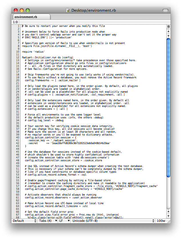
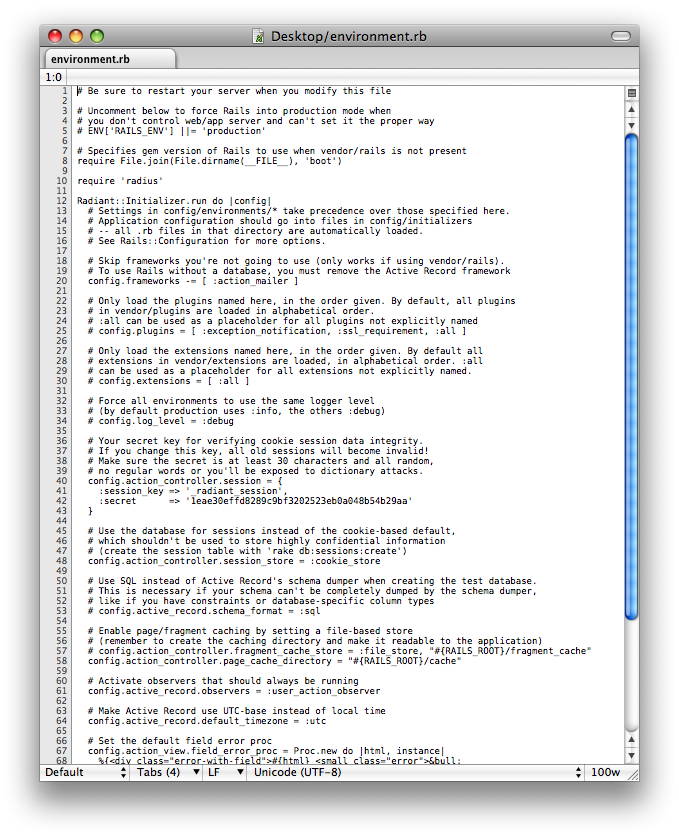
>> Yeah, that must be what's going on. I took a more careful look, and I
>> agree that there is very little difference in the antialiasing
>> between
>> the two samples. The character spacing makes the difference in
>> readability.
>
> Can you post the screenshots to this list or provide a link where we
> can all take a look at them?
I asked David for them, and he sent them to me. Here they are:

http://amnoid.de/tmp/SubEthaEdit%20enabled%20screen%20fonts.png
http://amnoid.de/tmp/SubEthaEdit%20disabled%20screen%20fonts.png

To me, the difference is not just character spacing: in the screen
fonts-enabled screenshot, the characters seem to be more aligned with
pixel lines and are thus often less "colorful" (they are colored at
all because of os x's subpixel antialiasing). For example, see the
left edge of the "U" in line 3 or the "E" in line 5.

Nico

--~--~---------~--~----~------------~-------~--~----~
You received this message from the "vim_mac" maillist.
For more information, visit http://www.vim.org/maillist.php
-~----------~----~----~----~------~----~------~--~---