Hi Pawel,

I'm forwarding your question to the website list where we have people
who will be able to help.
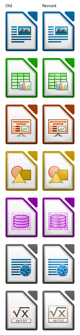
Regards,
Ivan.

---------- Forwarded message ----------
From: Paweł K.
Date: 2011/2/5
Subject: Re: [libreoffice-design] Weak icons

PS: How can I create (translate from english) polish version of
LibreOffice site?
http://www.libreoffice.org/international-sites/

W dniu 4 lutego 2011 16:39 użytkownik Paweł K.
<[email protected]> napisał:
>
> Hi,
> I think that file type icons sent to me by you will be great.
>
> Interface graphics (small toolbar icons in fe. Writer) for me is also (for
> today) bad - this icons have too much colors and, some of them, too many
> detail (eg. "Paste", "Font color"). This icons should be clear to understand
> and simple in design. Some of them have "cold" colors and others have more
> colors (eg. "Increase indent" [mainly white and dark blue] and "Font color"
> [blue and brown]) - they are diffrent in colors, I don't like it. For me all
> of this icons should be similar in colors and simplicity.
> It's my opinion.
> Greetings
>
> 2011/2/3 Ivan M. <[email protected]>
>>
>> Hi Pawel,
>>
>> 2011/2/3 Paweł K. <[email protected]>:
>> > I am writing about file type icons (fe. DOC, DOCX, ODT) and also about
>> > icons
>> > in LibreOffice toolbars (fe. button "Save", "Bold"). As I said, I like
>> > icons
>> > from OpenOffice 3.2.1.
>> > Thanks for fast reply and sorry for my bad English.
>>
>> Thanks for clarifying that - Christoph was right (he usually is ;P)
>>
>> We had lots of negative feedback on the OOo mailing lists about 3.2.1
>> icons (mainly because they lacked color) - it was quite a significant
>> issue and it made lots of users angry. One of the first things LibO
>> did was to revert the icons to the pre-3.2.1 style before new icons
>> could be implemented. We are now (almost) ready with those new icons,
>> and you can see them on this image:
>> http://2.bp.blogspot.com/_9MZR46ZEuS8/TURcR5CLQPI/AAAAAAAAAuA/6gLZ8h2RS9Y/s1600/RevisedIcons128px.png
>> For me they offer the best of both worlds: an improved design and much
>> needed color. What do you think?
>>
>> Regards,
>> Ivan.
>

--
Unsubscribe instructions: E-mail to [email protected]
List archive: http://listarchives.libreoffice.org/www/website/
*** All posts to this list are publicly archived for eternity ***