> On Apr 16, 2017, at 9:56 PM, Andrew Milner <[email protected]>
> wrote:
>
> Aha - I think I see ... the graph shows the layman's "calm before the storm"
> - after the storm has passed!!
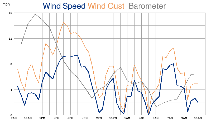
Right, it's not meant to be predictive.


> But the wind alone shows that (from steady low to increasing) - as does the
> change in pressure alone (from falling to rising).

Sure, but it's interesting to see how the wind and pressure correlate.


> What would be interesting would be to know the locations of high and low
> pressure in relation to the measuring station location ....

Agreed that would indeed be interesting.

Here's the live chart by the way:

http://sinkingsensation.com/weather/daywindbarometer3.png


>
> Guess I'll just put my head back in the sand where it belongs ....
>
>
>
>> On Monday, 17 April 2017 07:42:04 UTC+3, Alec Bennett wrote:
>>
>>
>>> On Sun, Apr 16, 2017 at 7:05 PM, Thomas Keffer <[email protected]> wrote:
>>> Sorry, but it is not possible.
>>>
>>> It's been asked for many times, but would require a pretty substantial
>>> rewrite of weeplot, as well as some creative use of ConfigObj.
>>>
>>> Your hack is actually not so crazy.
>>
>> Well alright then, liberal amounts of duct tape have been applied! See
>> attached.
>>
>>
>>
>> I still need to clean it up a bit and maybe not show gusts as well, and
>> change the color scheme, but that's the work in progress.
>>
>> > It's been asked for many times
>>
>> In that case I'll mention that my method was to edit genplot.py and
>> imagegenerator.py so if a filename has "-trans" in it, it builds just the
>> plot line on a transparent background with no labels. And every time a
>> regular graph is built it searches for a file with the same name but
>> "-trans" appended to it, and if found pastes it over the current graph. So
>> in the above example it built a transparent version of the barometer graph
>> with no labels and then pasted it over the wind graph. It's a kludge but it
>> works, and it required as little hard coding of parameters that I could
>> think of.
>>
>> Let me know if there's interest and I'll post this hack to my github page,
>> but fair warning it's *very* hacky, and currently it doesn't have the
>> ability to draw the Y axis labels for the 2nd item (in this case the
>> barometer). And of course it's not a regular user extension so it'll get
>> overwritten with any weewx updates.
>>
>> > Just out of curiosity - is there a specific reason for plotting
>> > windspeed/wind gust together with pressure?
>>
>> So we can see fronts moving through, which affect the wind speed, or so our
>> theory goes. Together with the wind direction vector chart, which is shown
>> right below this in  the iOS app I'm working on, people can get a good idea
>> of weather changes with just two graphs. At least that's our theory. And a
>> biggie for us is that we're duplicating some functionality from the Bodega
>> Marine Lab near us (run by the University of California at Davis), which has
>> this same chart.
>>
>>
>>
>> But
>>
>>
>>
>>
>>
>
> --
> You received this message because you are subscribed to a topic in the Google
> Groups "weewx-user" group.
> To unsubscribe from this topic, visit
> https://groups.google.com/d/topic/weewx-user/2FFE87-xqFU/unsubscribe.
> To unsubscribe from this group and all its topics, send an email to
> [email protected].
> For more options, visit https://groups.google.com/d/optout.

--
You received this message because you are subscribed to the Google Groups
"weewx-user" group.
To unsubscribe from this group and stop receiving emails from it, send an email
to [email protected].
For more options, visit https://groups.google.com/d/optout.