On Wed, 19 Nov 2014 15:06:16 +0100
Ancor Gonzalez Sosa <[email protected]> wrote:
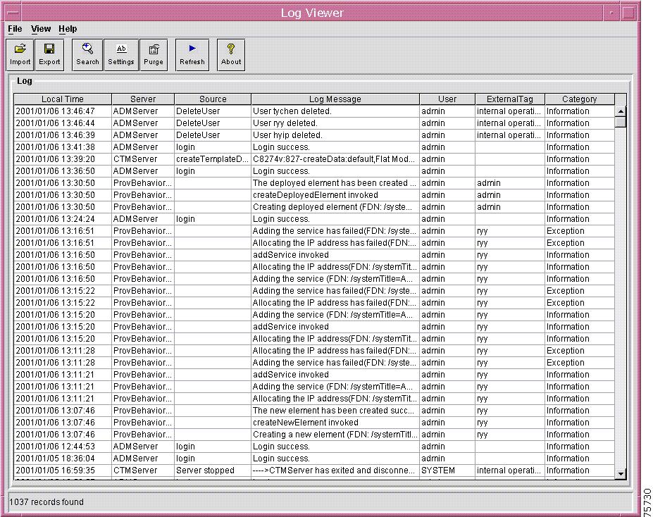
> On 11/19/2014 10:23 AM, Lukas Ocilka wrote:
> >
> > - cooperate with UI/UX expert(s), I'll have a chat with Ken soon to
> >   find out how we could find some possibility of cooperation
>
> Yes. I have started with some UI mockups. I though that doing them in
> libyui would be almost as fast as simply drawing them. I obviously
> overestimated my skills after 10 years without programming any GUI
> application. :-)
>
> After some hours, I finally have something that resembles what I have
> in mind (enough to get the idea, I hope)
>
> http://paste.opensuse.org/35073071
> http://paste.opensuse.org/15368649
>
> Feedback is appreciated.
>

ncurses screenshot missing time range, which for me looks containing too
much stuff.

In general it looks too crowded and there is too much control on page
and not so much space for messages.
I think it will be better to have here only two buttons:
refresh ( load new log entries )
filter ( specify filter by time and source )
( notice that there is no "OK" button, as I think that X for close is
enough )
and having almost all space for table with log entries, because it is
the most important information.

more like this tools:
http://www.cisco.com/c/dam/en/us/td/i/000001-100000/75001-80000/75001-76000/75730.tif/_jcr_content/renditions/75730.jpg
http://www.kiwisyslog.com/kiwiSysLog/media/images/products/LogViewer/carousel/Log-Viewer-Log-File.jpg?width=800&height=560&ext=.jpg
http://www.netupd8.com/w8img/972p7d.jpg

BTW coloring log entries according to its importance would be nice.

Just my 2c.

Josef
--
To unsubscribe, e-mail: [email protected]
To contact the owner, e-mail: [email protected]