peter (yahvuu) wrote:

first: let me say that there is some real innovative stuff in this
post, it is surely intriguing me.
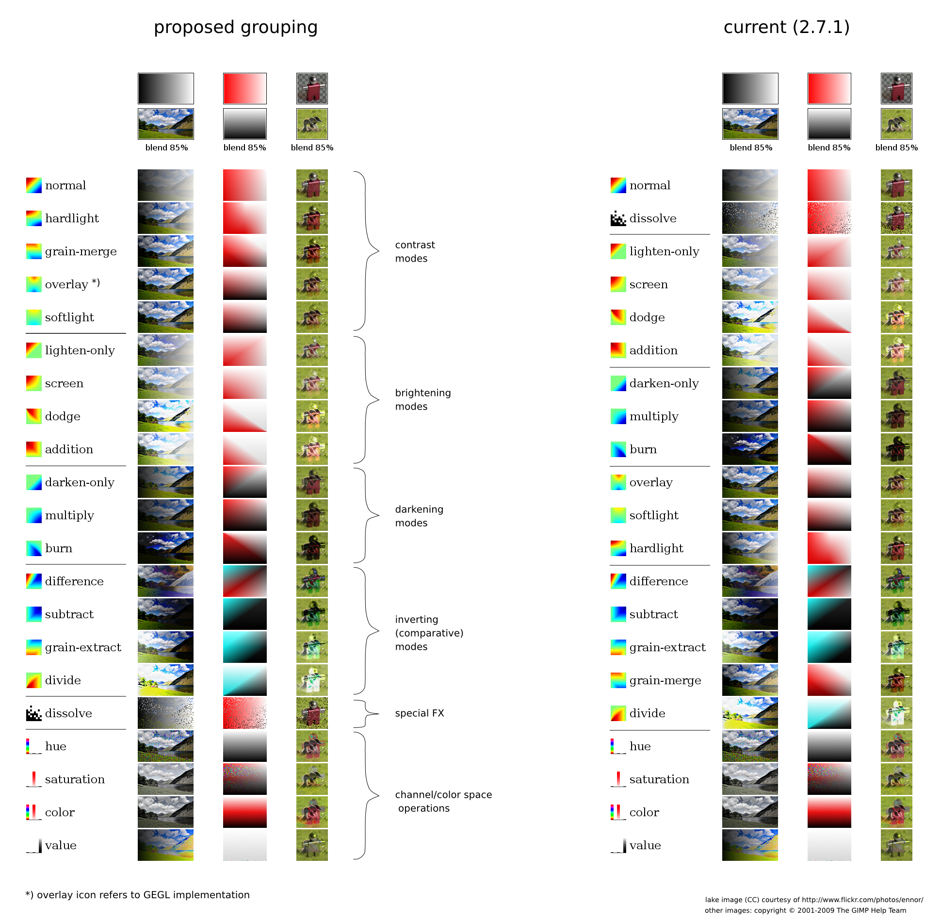
> here's an idea how icons for layer modes could look like:
> http://yahvuu.files.wordpress.com/2009/10/layermode-sshot-proposed.png
>
> The icons provide a color-coded overview of how blending affect
> brightness:
> - blue:  reduced brightness
> - green: neutral, brightness unchanged
> - red:   increased brightness
>
> Technically, these are diagrams where the x-axis is the bottom layer
> brightness
> and the y-axis denotes the top layer brightness. The brightness
> difference caused
> by the blending operation is then color-coded as described above.
> The full explanation is available at:
> http://yahvuu.wordpress.com/2009/09/27/blendmodes1/#brightness_diff

I oscillate here all the time between great and fail.

I could go into smaller stuff like the use of (SGA!) color
(UI theme colors must be taken into account) but there is a
much bigger interaction-design-fish to fry:

to have a reason to add these icons to GIMP, they really have to
add something for usability, not just be different enough icons that
happen to be similar in their group. what the icons have to deliver
is additional _user_insight_ into the modes, in addition to the name
of the mode. also this insight must _feel_ to be true, it must match
users' experience.

this is the ultimate arbiter and this plan needs work before it
makes a chance of getting there. I actually doubt that icons can be
made that pass the criteria above and not involve user-thinking of
"OK, a vertical ramp was overlaid with a horizontal one and..."

the current model for the use of modes is that users gather experience
through trying modes and evaluating results. the regrouping we done
after 2.6 is helping out in that regard, having alternatives in the
same group.

in that light this is also an interesting contribution:

> the reason for re-grouping is explained here:
> http://yahvuu.files.wordpress.com/2009/10/layermode-grouping.png

one of the first things it shows is what is working in Martin
Nordholts reordering (marked 2.7.1 in the pic above): that we have
sections in the menu that are described by their first item:
lighten(-only), darken(-only), overlay, difference.

what the new proposal points out is:

a) grain merge is in the wrong group, should be in overlay
b) normal mode is should be in overlay group, is strongest of all
c) dissolve is, ehm, special (btw: the icon of dissolve shown here
    really works according to the benchmark of insight _and_ feels
correct)

I say:

a) yes I see the point, let fix that
b) I am not sure and would like to know how users feel about this.
    I really do not like that suddenly everything is ordered
    strong-to-soft, the other groups are is soft-to-strong
c) we are stuck with it (are we?) and it depends on b) if it need
    to be moved around.

btw, here:

<http://yahvuu.files.wordpress.com/2009/09/table-brightness-1600.png>

there is a grab bag of modes never seen in GIMP. do we want to
(artistic need, not compatibility) and can (effort) add some of them?

wait! am I proposing bloat? >^}

     --ps

         founder + principal interaction architect
             man + machine interface works

         http://mmiworks.net/blog : on interaction architecture


_______________________________________________
Gimp-developer mailing list
Gimp-developer@lists.XCF.Berkeley.EDU
https://lists.XCF.Berkeley.EDU/mailman/listinfo/gimp-developer