Hi.
Thanks once more for helping me out.
Beside that you gave me a nice idea and here is the sample code of dashboard
for an R-powered race car that you can't wait to see  :)
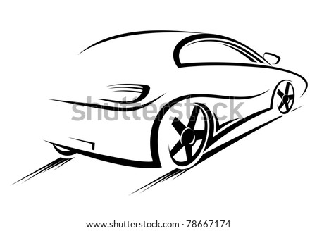
library(animation)
library(jpeg)

# Original code by Gaston Sanchez
# http://www.r-bloggers.com/gauge-chart-in-r/
# Modified by Jeff Hemsley

dial.plot <- function(label = "UseR!", value = 78, dial.radius = 1
          , value.cex = 3, value.color = "black"
          , label.cex = 3, label.color = "black"
          , gage.bg.color = "white"
          , yellowFrom = 75, yellowTo = 90, yellow.slice.color = "#FF9900"
          , redFrom = 90, redTo = 100, red.slice.color = "#DC3912"
          , needle.color = "red", needle.center.color = "black",
needle.center.cex = 1
          , dial.digets.color = "grey50"
          , heavy.border.color = "gray85", thin.border.color = "gray20",
minor.ticks.color = "gray55", major.ticks.color = "gray45") {

  whiteFrom = min(yellowFrom, redFrom) - 2
  whiteTo = max(yellowTo, redTo) + 2

  # function to create a circle
  circle <- function(center=c(0,0), radius=1, npoints=100)
  {
    r = radius
    tt = seq(0, 2*pi, length=npoints)
    xx = center[1] + r * cos(tt)
    yy = center[1] + r * sin(tt)
    return(data.frame(x = xx, y = yy))
  }

  # function to get slices
  slice2xy <- function(t, rad)
  {
    t2p = -1 * t * pi + 10*pi/8
    list(x = rad * cos(t2p), y = rad * sin(t2p))
  }

  # function to get major and minor tick marks
  ticks <- function(center=c(0,0), from=0, to=2*pi, radius=0.9, npoints=5)
  {
    r = radius
    tt = seq(from, to, length=npoints)
    xx = center[1] + r * cos(tt)
    yy = center[1] + r * sin(tt)
    return(data.frame(x = xx, y = yy))
  }

  # external circle (this will be used for the black border)
  border_cir = circle(c(0,0), radius=dial.radius, npoints = 100)

  # open plot
  plot(border_cir$x, border_cir$y, type="n", asp=1, axes=FALSE,
       xlim=c(-1.05,1.05), ylim=c(-1.05,1.05),
       xlab="", ylab="")
  # gray border circle
  external_cir = circle(c(0,0), radius=( dial.radius * 0.97 ), npoints =
100)
    # initial gage background
  polygon(external_cir$x, external_cir$y,
          border = gage.bg.color, col = gage.bg.color, lty = NULL)

  # add gray border
  lines(external_cir$x, external_cir$y, col=heavy.border.color, lwd=18)
  # add external border
  lines(border_cir$x, border_cir$y, col=thin.border.color, lwd=2)

  # yellow slice (this will be used for the yellow band)
  yel_ini = (yellowFrom/100) * (12/8)
  yel_fin = (yellowTo/100) * (12/8)
  Syel = slice2xy(seq.int(yel_ini, yel_fin, length.out = 30), rad=
(dial.radius * 0.9) )
  polygon(c(Syel$x, 0), c(Syel$y, 0),
          border = yellow.slice.color, col = yellow.slice.color, lty = NULL)

  # red slice (this will be used for the red band)
  red_ini = (redFrom/100) * (12/8)
  red_fin = (redTo/100) * (12/8)
  Sred = slice2xy(seq.int(red_ini, red_fin, length.out = 30), rad=
(dial.radius * 0.9) )
  polygon(c(Sred$x, 0), c(Sred$y, 0),
          border = red.slice.color, col = red.slice.color, lty = NULL)

  # white slice (this will be used to get the yellow and red bands)
  white_ini = (whiteFrom/100) * (12/8)
  white_fin = (whiteTo/100) * (12/8)
  Swhi = slice2xy(seq.int(white_ini, white_fin, length.out = 30), rad=
(dial.radius * 0.8) )
  polygon(c(Swhi$x, 0), c(Swhi$y, 0),
          border = gage.bg.color, col = gage.bg.color, lty = NULL)


  # calc and plot minor ticks
  minor.tix.out <- ticks(c(0,0), from=5*pi/4, to=-pi/4, radius=(
dial.radius * 0.89 ), 21)
  minor.tix.in <- ticks(c(0,0), from=5*pi/4, to=-pi/4, radius=( dial.radius
* 0.85 ), 21)
  arrows(x0=minor.tix.out$x, y0=minor.tix.out$y, x1=minor.tix.in$x, y1=
minor.tix.in$y,
         length=0, lwd=2.5, col=minor.ticks.color)

  # coordinates of major ticks (will be plotted as arrows)
  major_ticks_out = ticks(c(0,0), from=5*pi/4, to=-pi/4, radius=(
dial.radius * 0.9 ), 5)
  major_ticks_in = ticks(c(0,0), from=5*pi/4, to=-pi/4, radius=(
dial.radius * 0.77 ), 5)
  arrows(x0=major_ticks_out$x, y0=major_ticks_out$y, col=major.ticks.color,
         x1=major_ticks_in$x, y1=major_ticks_in$y, length=0, lwd=3)

  # calc and plot numbers at major ticks
  dial.numbers <- ticks(c(0,0), from=5*pi/4, to=-pi/4, radius=( dial.radius
* 0.70 ), 5)
  dial.lables <- c("0", "25", "50", "75", "100")
  text(dial.numbers$x, dial.numbers$y, labels=dial.lables,
col=dial.digets.color, cex=.8)


  # Add dial lables
  text(0, (dial.radius * -0.65), value, cex=value.cex, col=value.color)
  # add label of variable
  text(0, (dial.radius * 0.43), label, cex=label.cex, col=label.color)

  # add needle
  # angle of needle pointing to the specified value
  val = (value/100) * (12/8)
  v = -1 * val * pi + 10*pi/8 # 10/8 becuase we are drawing on only %80 of
the cir
  # x-y coordinates of needle
  needle.length <- dial.radius * .67
  needle.end.x = needle.length * cos(v)
  needle.end.y = needle.length * sin(v)

  needle.short.length <- dial.radius * .1
  needle.short.end.x = needle.short.length * -cos(v)
  needle.short.end.y = needle.short.length * -sin(v)

  needle.side.length <- dial.radius * .05
  needle.side1.end.x = needle.side.length * cos(v - pi/2)
  needle.side1.end.y = needle.side.length * sin(v - pi/2)
  needle.side2.end.x = needle.side.length * cos(v + pi/2)
  needle.side2.end.y = needle.side.length * sin(v + pi/2)

  needle.x.points <- c(needle.end.x, needle.side1.end.x,
needle.short.end.x, needle.side2.end.x)
  needle.y.points <- c(needle.end.y, needle.side1.end.y,
needle.short.end.y, needle.side2.end.y)
  polygon(needle.x.points, needle.y.points, col=needle.color)

  # add central blue point
  points(0, 0, col=needle.center.color, pch=20, cex=needle.center.cex)
  # add values 0 and 100
}

##############################################################


setInternet2(use = TRUE)
download.file("
http://image.shutterstock.com/display_pic_with_logo/322090/322090,1307359665,10/stock-photo-car-silhouette-for-race-sports-design-vector-version-also-available-in-gallery-78667174.jpg
",
              destfile=file.path("..", "Desktop/racing_car.jpg"), mode="wb")

racing_car <- readJPEG(file.path("..", "Desktop//racing_car.jpg"))
speed <- c(1:100, 81:100)

owd = setwd(tempdir())
oopt = ani.options(interval = 0.1, nmax = 120)

for (i in 1:120)
{
png(sprintf("rc%03d.png", i))
par(mai=c(0,0,0.2,0))
layout(matrix(c(1,2,1,2), ncol=2), height=c(4, 2))
plot(1:2, type='n', axes=FALSE, xlab="", ylab="")
rasterImage(racing_car, 0.95+i*0.005, 1.1+i*0.005, 1.2+i*0.005,
1.53+i*0.005, angle=-5)
if ((i%%2)==0) {title("Dashboard for an R-powered race car")}
dial.plot (label = "Speed km/h", value = speed[i], dial.radius = 1
      , value.cex = 2, value.color = "white"
      , label.cex = 0.8, label.color = "white"
      , gage.bg.color = "black"
      , yellowFrom = 75, yellowTo = 100, yellow.slice.color = "red"
      , redFrom = 100, redTo = 100, red.slice.color = "red"
      , needle.color = "red", needle.center.color = "white",
needle.center.cex = 0.6
      , dial.digets.color = "white"
      , heavy.border.color = "white", thin.border.color = "black",
minor.ticks.color = "white",
       major.ticks.color = "white")
title(paste("Average speed = ", mean(sample(1:100, 10))))
dev.off()
}

im.convert("rc*.png", output = "animation.gif")
setwd(owd)
file.remove(file.path("..", "Desktop//racing_car.jpg"))

Andrija


On Wed, Apr 3, 2013 at 11:24 AM, Barry Rowlingson <
b.rowling...@lancaster.ac.uk> wrote:

> On Tue, Apr 2, 2013 at 4:00 PM, R. Michael Weylandt
> <michael.weyla...@gmail.com> wrote:
> > Look at the R GoogleVis package.
>
>  Or read what Hadley W had to say on a similar question first:
>
> "The question would why would you want to?  You are trying to
> understand your data, not driving a race car or aeroplane.  "
>
>  -
> http://r.789695.n4.nabble.com/Graphical-output-dials-and-meters-for-a-dashboard-td845090.html
>
> But maybe you *are* creating a dashboard for an R-powered race car, in
> which case here's an R-native version of the google vis speedometers:
>
> http://gastonsanchez.wordpress.com/2013/01/10/gauge-chart-in-r/
>
> Can't wait to see the full source code for your race car:
>
> require(engine)
> block = engine(cc="2000",cylinders=6)
> require(downforce)
> ...
>
> Barry
>

        [[alternative HTML version deleted]]

______________________________________________
R-help@r-project.org mailing list
https://stat.ethz.ch/mailman/listinfo/r-help
PLEASE do read the posting guide http://www.R-project.org/posting-guide.html
and provide commented, minimal, self-contained, reproducible code.