On 01/13/2010 02:46 PM, Rex C. Eastbourne wrote:
On Tue, Jan 12, 2010 at 5:26 PM, Rex C. Eastbourne<rex.eastbou...@gmail.com
wrote:
Let's say I have data in the following schema that describes the number of
purchases a company has received from each County in the US:
State | County | Purchases
---------------------------------------
NJ | Mercer | 550
CA | Orange | 23
....
I would like to visualize what states contribute the most to the overall
total, and furthermore within those states, what Counties contribute the
most. What are some recommended R visualizations for this type of data? I
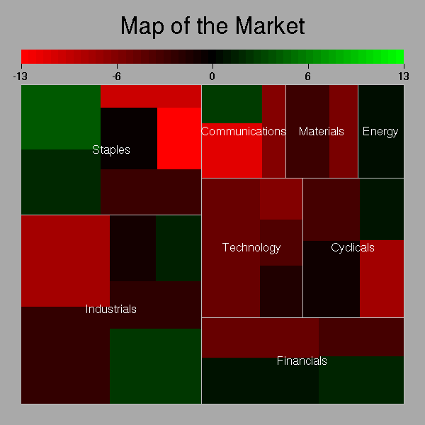
created a treemap using map.market from the portfolio library, like the
following:
http://zoonek2.free.fr/UNIX/48_R/g126.png
Although this is an attractive visual, I want something that makes it
easier to compare the relative sizes of components at a glance (hard with a
treemap because rectangles have different aspect ratios). Does anyone have a
recommended alternate visualization?
Thanks!
Just to clarify: I made up the above example for simplicity's sake to
illustrate what I meant by "hierarchical" data. My actual data is not
related to maps or geography, so a map-based visualization wouldn't work.
Hi Rex,
Have a look at the hierobarp function in the plotrix package. It
produces nested bars that begin with the overall value.
Jim

______________________________________________
R-help@r-project.org mailing list
https://stat.ethz.ch/mailman/listinfo/r-help
PLEASE do read the posting guide http://www.R-project.org/posting-guide.html
and provide commented, minimal, self-contained, reproducible code.