I really hope this doesn't become the standard for the keyboard. I
detest death note with a huge passion.
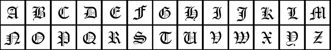
On 03/17/2017 03:55 PM, John Luke Gibson wrote:
> I was wondering what people think of the Cloister Black letter E for
> the EOMA logo. I can imagine that some people might find it hard to
> read or understand. Legible enough any one would suppose?
>
> http://www.deathnotenews.com/uploads/1/7/3/9/17393465/5192168_orig.png
>
> In case anyone is worried about copyright claim, apparently the
> original authors found the font on gimp, which is absurd because it's
> not an in-built font so it must have been a system font that they just
> casually assumed was free since they found it in gimp >.>
>
> Regardless, I found the font as a free [as in beer] font on a font
> sale website with the name matching and each letter meticulously
> matching. Through there I found the author's website which is in
> German and has many other font downloads of various styles. Through
> google-translate I discovered that german text on the page said free
> for "private" use, whatever that means (maybe if someone knows
> German?) and they reiterated "you may use" multiple times in the
> comments. Unfortunately, they seem to have a lot of fonts on the
> website which they've been updating occasionally "Cloister Black"
> included. In fact the name no longer shows "Cloister Black" on their
> website and instead shows "Old English", but through the wayback
> machine I found an archived version that shows "Cloister Black". I'll
> post the link here when I get a chance, I saved it on my other
> computer.
>
> _______________________________________________
> arm-netbook mailing list [email protected]
> http://lists.phcomp.co.uk/mailman/listinfo/arm-netbook
> Send large attachments to [email protected]


_______________________________________________
arm-netbook mailing list [email protected]
http://lists.phcomp.co.uk/mailman/listinfo/arm-netbook
Send large attachments to [email protected]