Hi again,
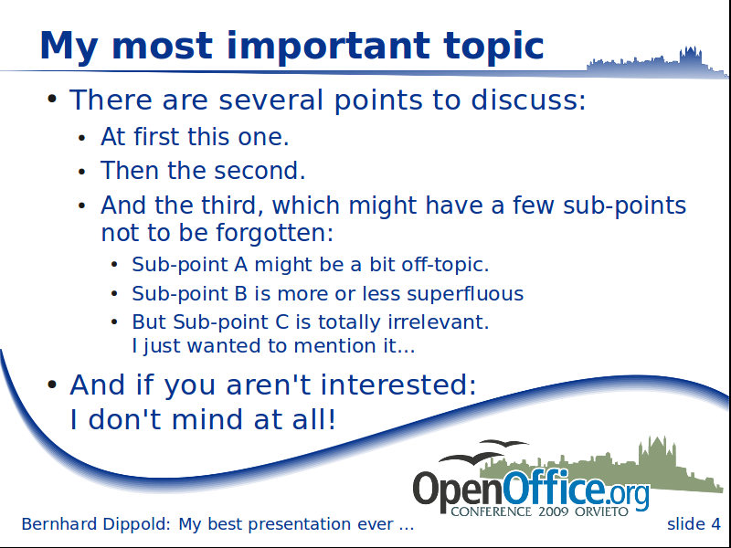
I created a new version of the slide draft, like the minimal version,
but with a small gradient for the curve and a broadened part with the
town silhouette at the top.
I uploaded it to
http://wiki.services.openoffice.org/w/images/2/23/OOoCon_slide_new.png

It is linked from the Impress template gallery page:
http://wiki.services.openoffice.org/wiki/Art/Gallery/ImpressTemplates

and part of the updated Impress file:
http://wiki.services.openoffice.org/wiki/File:OOoCon09_template.odp
The Impress file contains a second Title slide using the original OOo
blue tone for the gradient and for the OOoCon logo itself (the creator
of the logo modified the OOo logo color - I don't know if he got the
allowance to do so...)
Both the new slide and the alternative title are using raster graphics
instead of vectors - the slide looks smoother than the old version at my
800x600 screen, but the alternative title has not been improved...
What do you think of the new slide? (As title I prefer the old one even
if it uses the wrong colors)
Don't hesitate to tell me any idea for improvement.

Best regards

Bernhard

---------------------------------------------------------------------
To unsubscribe, e-mail: art-unsubscr...@marketing.openoffice.org
For additional commands, e-mail: art-h...@marketing.openoffice.org