Hi Bernard,

Bernhard Dippold wrote (20-9-2009 22:07)
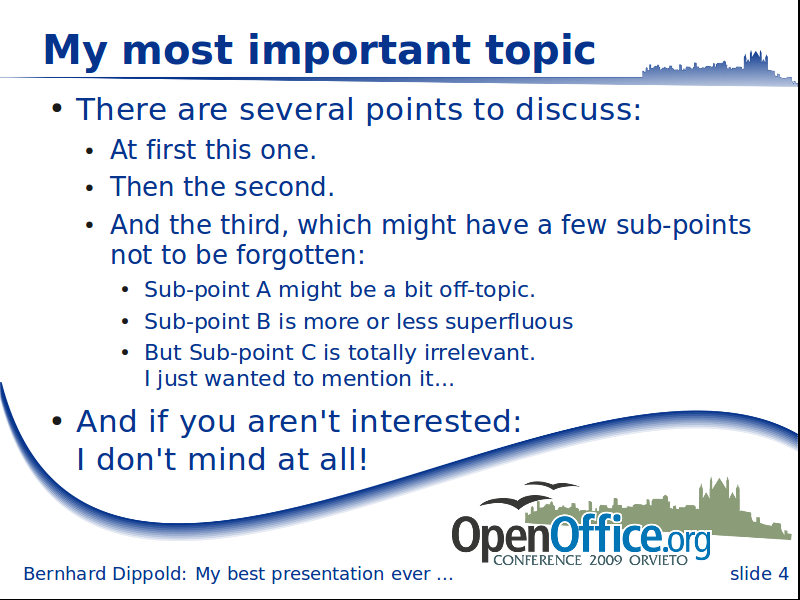
I created a new version of the slide draft, like the minimal version,
but with a small gradient for the curve and a broadened part with the
town silhouette at the top.
I uploaded it to
http://wiki.services.openoffice.org/w/images/2/23/OOoCon_slide_new.png
[...]
I like this one even more.
I was a bit careful with the full black of the first design round, since
that often does not look so good when printed black-whit.
Both the new slide and the alternative title are using raster graphics
instead of vectors - the slide looks smoother than the old version at my
800x600 screen, but the alternative title has not been improved...
[...]
The new slides look very rough at my computer (Windows and Linux)
Do they possibly suffer from a bug, somewhere in the dev-stack, that the
original graphics were replaced by the thumbnails?
Apart from that, I prefer slide 1 and 4.

Best,
Cor


--
Cor Nouws
  - nl.OpenOffice.org marketing contact
  - Community Contributor Representative in the Community Council
Gevoel niet vrij te zijn? Zie www.nieuwsteversie.nl

---------------------------------------------------------------------
To unsubscribe, e-mail: art-unsubscr...@marketing.openoffice.org
For additional commands, e-mail: art-h...@marketing.openoffice.org