Daniel Carrera wrote:
Hey,
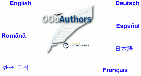
Two slight variations on the front page:

http://oooauthors.org/front3.html
http://oooauthors.org/front4.html
These pages use image maps, so everyone will see the Japanese and Korean
links correctly.
tip - what I did to see the fonts: Installed on my Linux system korean
fonts (yum install fonts-korean) and suddenly I can see both ko and ja.
this was necessary because when the sistem was installed I selected
nothing inside "Language Support".
complaint: the diacritics used for "Romãnă" are wrong, it should be
"Română", with the html code "Română" (â instead of
ã)
The first page uses a PNG image, the second a JPEG. JPEG is a lossy
format. This means that the download size is smaller, but the image
doesn't look as good. In this instance, it means that the colour blue is
less vivid.
Note: I changed the bottom links colours in -4- to match the jpg.
I'd appreciate it if someone could compare these. Especially someone
with a dial-up connection. Does the JPEG one (4) look good? Is it worth
the 12 kb (33%) size savings?
the difference is hard to see.
another solution is to use an indexed (256 colors) PNG, the file size is
even smaller and I believe the difference is also hard to see:
http://ooo.nicubunu.ro/oooauthors/front_indexed.png
I am NOT on dial-up and don't notice the loading speed but bandwidth
should be saved always.
I like making the site accessible. So if the jpeg one looks good, I'd
like to use it.
I would use the indexed PNG, the saving is huge, 20k (62%)

--
nicu
my OpenOffice.org pages: http://ooo.nicubunu.ro