On 5/12/2016 9:58 PM, Eric Smith wrote:
I just got the new boards:
https://www.flickr.com/photos/22368471@N04/albums/72157668325096875

Differences of new version:

* bezel is black with white legends
* legend font is a bit larger and heavier
* legends are above switches
* switch PCB wiring errors fixed
* right angle header
* plastic caps installed on all toggles

I assembled the new one with C&K switches that are more readily
available (e.g., from Digi-Key and Mouser), but I don't like them as
much. Originally I used switches with a V-bracket which makes
alignment and assembly easier, and they have a uniform threaded
bushing height. The more common toggle switches have a longer threaded
bushing. This can be seen by comparing the edge-on views; for the more
common switches without the V-bracket, the red switch body is seen.

I'm soliciting input as to whether the switch legends should be
changed from the vector font to a "real" font, and if so, what font
and size is desired.
Not sure if I am completely understanding the concerns with the
switches, but:
 * I would install the switches and run the top nut out to the very
   end, then back the inside nut up to it on the other side of the bazel
 * Once all switches are installed, then insert the board and solder.
Of course, this fails if the bezel has to be only a certain height above
the PCB, but perhaps that is not critical and thus my idea has a chance
of working.
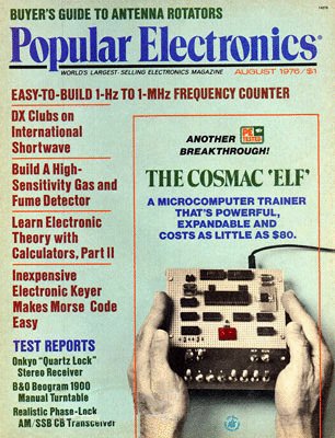
I'm not your market segment, but I think a better font would be
welcome. I looked online for a bit, but saw no specific font that would
have historical value, except Popular Electronics' font on the cover
that month:
http://www.sunrise-ev.com/photos/PopularElectronicsAug76.jpg

Jim


--
Jim Brain
[email protected]
www.jbrain.com