...opinion...

I definitely don't like the first one. I would like the 2cnd one more if it
did not have the dots/eyes. My first impression is that it has something to
do with the "following eyes" (eyes follow the mouse pointer).  This
animation/interaction is like a "hello world" for it's kind. Why do you need
the dots/eyes?  It does not add any value. If you are looking to make a
character then you could have the eyes "open" when necessary. And why does
the first "o" have a dot/eye?
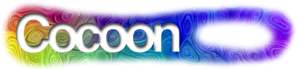
fwiw, I can see a cool, simple, flash-like animation (I am sure this is not
original :) with this font:
[ this is a quick splash intro animation ]
- A line (the catepillar) quickly crawls from left-offscreen (off-browser)
to quickly crawl through the letters of "cocoon".
- a trail was left to leave the word cocoon on screen
- when it comes out of the "n" - a bunch of different butterflies come out
and fly down/off the page

best,
-Rob


----- Original Message -----
From: "Lewis, Andrew J" <[EMAIL PROTECTED]>
To: <[EMAIL PROTECTED]>
Sent: Monday, December 31, 2001 5:07 AM
Subject: RE: Cocoon Logo


> I also have no right to vote, but as someone actively working on including
Coccon and other Apache project in my professional work, I much refer the
new logo. It may not have the "cool" effects, but it is far better suited to
"branding" the technology and definately is easier to integrate in to a
page. Honestly, the new logo makes it easier for me to "sell" the technology
to my clients. Stefano has it right - simplicity is key for logo design.
>
> > ----------
> > From: Bertrand Delacretaz[SMTP:[EMAIL PROTECTED]]
> > Reply To: [EMAIL PROTECTED]
> > Sent: Monday, December 31, 2001 6:16 AM
> > To: [EMAIL PROTECTED]
> > Subject: Re: Cocoon Logo
> >
> > I don't have the right to vote here, but I find the new logo much more
> > "distinctive" and "modern".
> >
> > IMHO comparing both logos out-of-context like from these URLs
> >
> > > On Sunday 30 December 2001 17:50, giacomo wrote:
> > > . . .
> > > 1. http://xml.apache.org/cocoon1/images/cocoon.jpg
> > > 2. http://xml.apache.org/cocoon/images/cocoon.gif
> > > . . .
> >
> > Doesn't do justice to the new logo which I think integrates better in a
page,
> > and draws attention by being harder to read.
> >
> > To me the new logo looks more like "artwork" than the old one which I
see as
> > "the word Cocoon written in a funny way".
> >
> > My 2 cents...
> > --
> >  -- Bertrand Delacr> �taz, www.codeconsult.ch
> >  -- web technologies consultant - OO, Java, XML, C++
> >
> >
> >
> >
> >
> >
> > ---------------------------------------------------------------------
> > To unsubscribe, e-mail: [EMAIL PROTECTED]
> > For additional commands, email: [EMAIL PROTECTED]
> >
>
> ---------------------------------------------------------------------
> To unsubscribe, e-mail: [EMAIL PROTECTED]
> For additional commands, email: [EMAIL PROTECTED]


---------------------------------------------------------------------
To unsubscribe, e-mail: [EMAIL PROTECTED]
For additional commands, email: [EMAIL PROTECTED]